A well-executed call to action (CTA) is a key element of effective digital marketing.
It compels viewers to take action and is the gateway to acquiring leads and converting them to potential customers. It’s the driving force behind lead generation, and it can make or break your sales funnel.
Just a simple thing such as using a button instead of text boosts conversion rate by up to 45%, speaking volumes about why CTAs are a critical part of any marketing campaign, and without them, you’re literally leaving money on the table.
But what makes a call to action irresistible? And how can you make sure that your CTA stands out from the competition?
We’ll take a look at real-life call to action examples, and also share some best practices to help you create CTAs that convert.
Do you want to level up your sales funnel today? Read on to learn more.
Table of Contents:
- 8 Best Call to Action Examples to Draw Inspiration From
- What is a call to action?
- What makes a call to action effective?
- Before you write a CTA
- Best practices to consider when designing your call to action
- Wrap up
8 Best Call to Action Examples to Draw Inspiration From
Before we dive into the nuts and bolts, tips, and tricks of a call to action, let’s dive straight into what you came here to read about:
Irresistible call to action examples used by top digital marketers in the world.
Call to Action Examples for Landing Pages and Websites
1. Chipotle
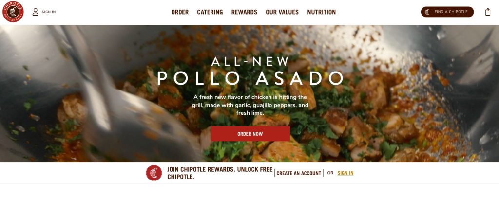
Unlike most generic CTAs like “submit” or “subscribe”, Chipotle goes straight for the kill with a direct CTA that works for them, “order now”.
What makes this CTA work is everything that leads up to the CTA:
- A new offer
- Something that a reader would instantly desire
- Mouthwatering and fresh ingredients
- A video that shows a professional cooking YOUR meal
5 lines of text instantly sell and fulfill a hungry visitor’s desires, and kindly shows exactly what they should do next in order to fulfill that desire, by ordering NOW. In fact, videos are proven to increase conversions by up 144%.
Chipotle masterfully executes this CTA, and you bet that it works! The CTA button is in line with their branding colors, but you can play around with contrasting colors in order to make the button pop from the background.
2. Netflix
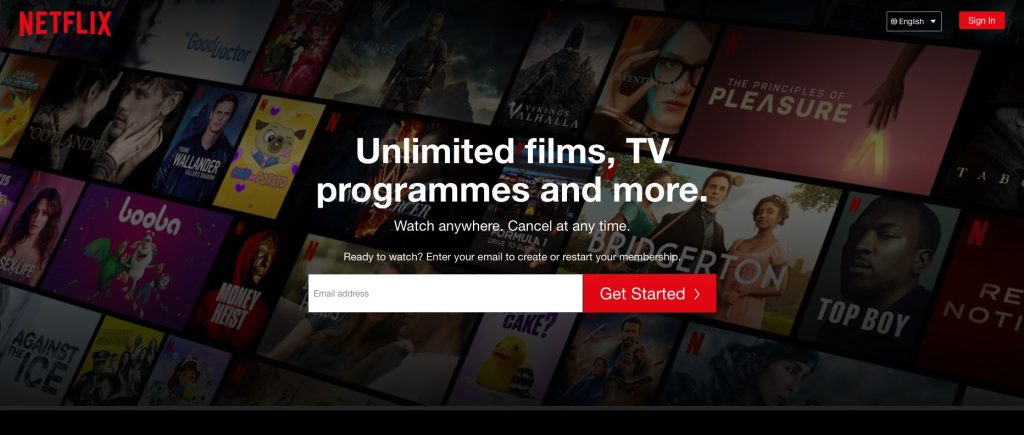
Netflix is globally known for providing A+ streaming services for your entertainment. What really hits home in this CTA is the massive benefits you get when you take the next step, “Get Started”.
Get started with what? Unlimited films, watch anywhere, and cancel any time! There is literally no reason NOT to sign up.
Call to Action Examples for Email Campaigns
3. Jasper
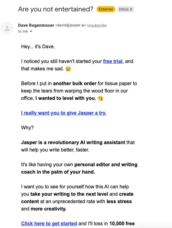
Everyone is literally bombarded with promotional emails daily, and marketers are getting very creative with grabbing your attention.
Just take a look at the example above from Jasper, an AI writing software for copywriters and digital marketers.
Jasper goes heavy with building an emotional response with you from the very first row of text, and even includes a CTA while at it with a “Free Trial” link.
But the real CTA comes further down after building even more rapport with you, and he boldly says “I really WANT you to give Jasper a TRY”.
Why this CTA works is that he comes across as someone who genuinely wants to help you, believes in the product and that you have nothing to lose as it’s free and you can just try it.
Masterful copywriting by playing the emotional card.
4. Canva
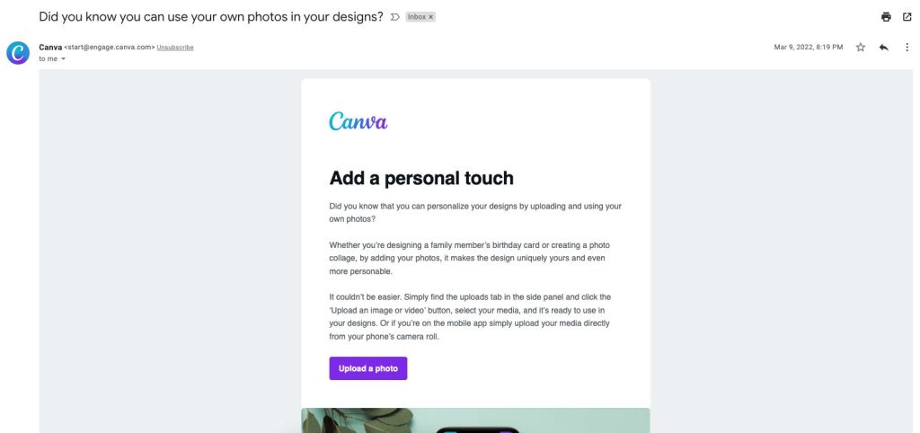
Canva has a unique CTA which you don’t see in most marketing material, and it uniquely works for them and their SaaS product.
In fact, personalized CTAs perform 202% better than basic CTAs, and Canva takes advantage of that.
Instead of a “try now” or “it’s free” kind of generic CTA, they go for “Upload a photo”, which is genius.
It’s a hidden message in the CTA that essentially says:
- Get started NOW
- Try it
- No registration required
- Easily do what you need to do
All of the above points are unconsciously conveyed to you with a simple but effective CTA like “Upload a photo”.
Now of course for this CTA to work, it depends heavily on the copy before, where Canva explains why and the benefits of uploading a photo to their service.
Call to Action Examples for Facebook & Instagram ads
5. SoundCloud

Copywriting for ads is complex and a huge topic that requires months of experience to pull off. But why reinvent the wheel when we can take a look at top ads by huge companies like SoundCloud.
It’s apparent that SoundCloud has a very good grip on who their audience is, and is laser targeting them with this ad, the creators.
Aside from producing music and learning the ins and outs of it, the number one problem for musicians is to get paid. SoundCloud backs this up by making the experience of getting paid risk-free and for a low cost.
Of course, you want to “Sign Up” and try it.
6. Amazon Music

Here is why this Instagram ad from Amazon works: it’s framed as an exclusive and time-limited offer.
What you’re instantly hit with is an irresistible offer, 6 months of Disney+, for free! Add a bit of classic FOMO (Fear Of Missing Out) with a limited deal, and you’re bound to get a ton of leads with the CTA “Get Offer”.
Clean, simple, and straight to the point with a huge benefit drive offer. Instagram ads should not be overlooked.
Call to Action Examples for E-commerce
7. Manscaped
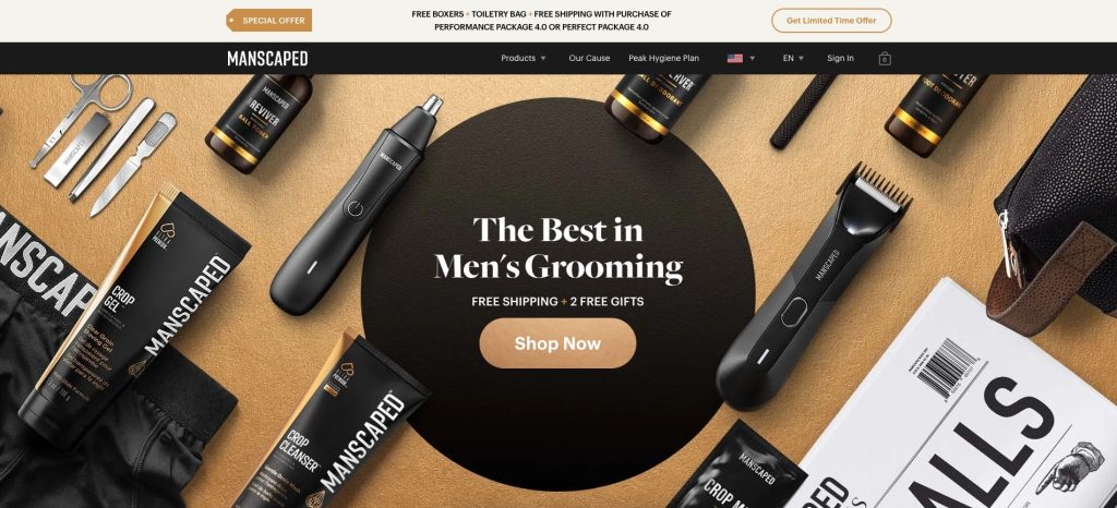
Manscaped hits you with a very direct and bold statement, that they are the best in Men’s Grooming.
So why would anyone click that single and obvious button in the middle? Benefits!
Not only do you get the best in grooming (according to them), but also free shipping and not one, but two free gifts.
The CTA is very clear and perfectly placed with a “Shop Now” button and matches the surrounding branding and colors.
The only thing that’s missing would be some kind of testimonials above the fold (what you see before the need of scrolling down further), but the risk is that the page becomes too cluttered.
Nonetheless, a very clean and well-executed CTA.
8. Apple
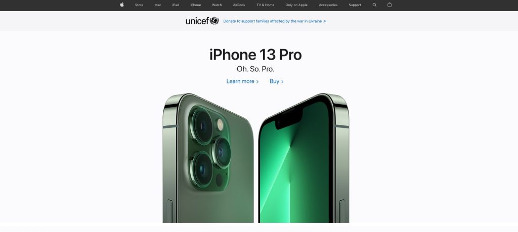
The behemoth of smartphones, Apple barely needs any introduction and they know it. It’s still worth taking notes, as some of the best copywriters work for them.
There are 6 words in total for this CTA, and two simple options for a reader to do, either “Learn More” or “Buy”.
What makes this CTA work is the suspense of the high-quality image, that doesn’t reveal everything.
You either WANT to learn more about this eye candy of a phone, or you’ve already decided and WANT it now.
What is a call to action?
By now you probably know what a call to action (CTA) is, but let’s elaborate a bit on it.
CTA’s are text or graphic instructions to a visitor, be that on a website or on social media, urging them to perform a specific action such as subscribing to a newsletter, downloading an ebook, or making a purchase.
CTAs come in all shapes and sizes, but all share the same goal:
Enticing the visitor to take the next step.
CTAs are an essential part of any digital marketing campaign, as they are the means by which you convert leads into customers. Done well, CTAs are irresistible; done poorly, they can quickly turn off website visitors.
What makes a call to action effective?
There are quite a few qualities that make a call to action effective.
The most important is that it must be relevant to the user and their desires. If you ask someone to do something that isn’t relevant to them, they’re much less likely to follow through.
In addition, a good call to action should be easy to understand and use. It should be obvious what the user needs to do in order to take advantage of the offer or get more information.
Finally, a strong call to action should be motivating. It should make the user feel like they’re missing out if they don’t take action right away, and strike while the iron is hot.
Before you write a CTA
Before you write any CTA, it’s important to first determine your goal and identify your target audience. What do you want your viewer to do? What action do you want them to take?
Who is your audience?
Your call to action (CTA) should target your audience and match the offer you’re promoting, as demonstrated by the best CTA examples above.
If you’re a social media agency, for example, your CTA might urge people to sign up for a free trial of your social media monitoring tool.
If you work in digital marketing, you might ask readers to subscribe to your blog for exclusive updates and insights. It’s important to be clear about what you want people to do and make it easy for them to take the next step.
Once you know this, you can craft a CTA that is tailored to them and that encourages leads to take that desired action. Collecting customer feedback definitely helps in figuring out the desires or problem areas of your audience.
Keep in mind that your CTA should be clear, concise, and easy to understand. It should also be visually appealing so that it catches the viewer’s attention and encourages them to click through.
Best practices to consider when designing your call to action
CTAs can be a bit tricky. You want them to be irresistible, but you also don’t want to mislead your readers.
A good rule of thumb is to make sure your CTA is clear and easy to understand. It should also match the tone and style of your site or ad.
For example, a playful or humorous site might use fun, eye-catching CTAs, while a more serious website would likely use more professional language and design.
When it comes to CTAs, less is more. Don’t bombard your readers with too many options or they may not know where to start. Apple manages to pull this off with two CTAs, and that is probably the max that anyone should aim for, preferably only one.
Start with one main CTA and see how it goes.
How to measure the effectiveness of a call to action
Measuring the effectiveness of a call to action is essential for understanding whether or not it’s working and needs to be tweaked or changed.
One way to do this is to track how many people click on your call to action. Another way is to track how many people take the desired action after clicking on the call to action, like purchasing a product.
This will give you a good indication of how well your call to action is performing and whether or not it needs to be changed or improved.
Always keep your CTA above the fold on a website
Most people won’t bother scrolling down on a web page if the CTA is placed further down.
That’s why it’s important to keep your CTA above the fold. The fold is that imaginary line that separates the top part of a web page from the rest.
You only have a few seconds to capture a user’s attention before they move on, so make sure your CTA is front and center when they land on your page.
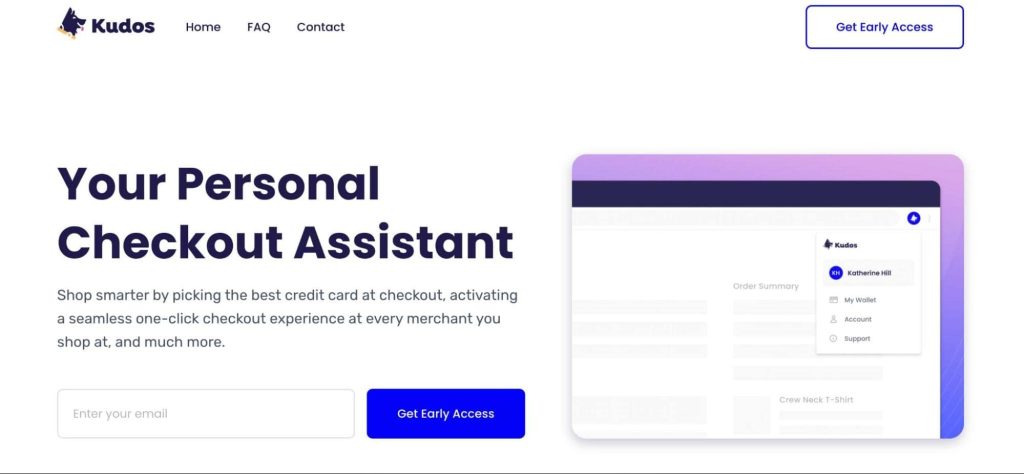
A great example of simplicity used to capture a user’s attention is Kudos’ homepage. It serves as a landing page that does not have an overwhelming amount of information and includes a clear CTA as soon as the page loads.
Don’t just tell people to do something (tell them why they should do it)
Too often, we digital marketers tell people what to do without giving them a compelling reason why. As a result, our CTAs fall flat and people are less likely to take the desired action.
This is backed up by a psychological study that shows that just using the word “because” boosts a favorable response with 93% compared to using it without.
Rather than simply telling people to “subscribe now,” for example, try telling them what benefits they’ll enjoy by subscribing.
- Will they get exclusive content?
- Early access to events?
- The ability to participate in polls or surveys?
- Greater insights into their brand or industry?
When you give people a reason to do something, they’re more likely to act on your CTA.
Use a call to value instead of a call to action
This ties into the point above, instead of using a call to action, try thinking about more along the lines of a call to value.
A call to value asks the reader to think about the benefits they’ll receive from taking your desired action.
For example, “Increase your online visibility” has a lot of appeal because it’s easy to understand and quantify. It also speaks to the reader’s ego, which is always a plus.
“Get more leads that turn into customers” is another great example of a call to value because it taps into the reader’s desire for more business and financial success.
When you use a call to value, be sure to focus on the benefits that your ideal customer will get by taking action.
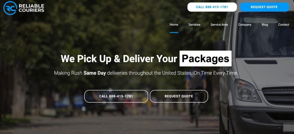
An example of this is Reliable Couriers which goes all-in on the value for their customers by picking up and delivering packages on the same day!
They understand this and not only choose the wording of their landing page carefully but also have two different call to action buttons, ensuring users can quickly get in touch and take the next step.
Create a sense of urgency
One way to create a sense of urgency is to use some kind of limited offer as used by the Amazon ad. Urgency can also be inspired by fear of missing out (FOMO) or the need to take immediate action.
For example, if you’re running a sale, you could use a call to action that says “Ends tonight!” or “Don’t miss your chance!”
Use what works best for your brand and your target audience. The most important thing is to make sure your call to action stands out and is impossible to ignore.
Strike a balance between creativity and simplicity
As you can see, there’s no one-size-fits-all answer when it comes to creating effective CTAs. However, there are a few general tips to keep in mind.
First, strike a balance between creativity and simplicity. You want your CTA to be eye-catching and memorable, but you don’t want it to be so complex that users can’t figure out what you’re asking them to do.
Second, make sure your CTA is easy to find and prominent on the page.
And finally, test, test, test! Try out different versions of your CTA and see which ones get the best response.
Employ social proof
One of the most powerful psychological motivators is social proof.
We are programmed to look to others for cues on how to behave, which can be extremely useful when it comes to taking action. By using social proof in your CTA, you can subtly encourage people to take the desired action.
There are a number of different ways to do this, but some effective tactics include using testimonials, case studies, or social media evidence.
For example, if you have a testimonial from a well-known expert or celebrity, you could use that to support your CTA.
Similarly, if you can show that a large number of people have already taken advantage of your offer, that’s social proof in action.
Always keep testing
When it comes to creating effective calls to action, you always need to keep testing.
Try out a different copy, different designs, and different placements. See what works best for your audience and your goals.
You might find that a softer call to action works better for your brand, or that a more aggressive CTA generates more leads.
It’s important to always be evolving and iterating on your CTAs so that you can continue to see results.
Use power strong action words and phrases
There’s a reason why copywriters use powerful words and phrases in their ads and headlines, they work!
And when it comes to your call to action, you want to make sure that you’re using the strongest language possible to motivate your readers.
So what makes a strong action word? It’s something that urges the reader to take immediate action. Here are a few examples:
- Act now!
- Don’t wait!
- Download now!
- Get started today!
Provoke emotion or enthusiasm
Some of the most successful calls to action provoke a strong emotional response or excitement, as we saw in the email campaign from Jasper.
When people feel an emotional response, they’re more likely to take action, especially if it’s a positive one. So, if you can create a sense of urgency or excitement around your call to action, you’re more likely to get people to click it.
An example of this is a call to action in an article about “27 Cats Who Are So Cute You Will Literally Die.” The CTA asks readers to “click to see the cutest cats of all time.” This provokes an emotional response in readers and encourages them to take action.
The result? Thousands of people click through to see the adorable cats!
Wrap up
A call to action is an essential part of any digital marketer’s toolkit and a great way to increase engagement on your digital channels.
To make sure your call to action is as effective as possible, it’s important to think about who your audience is, what you want them to do, and what makes them more likely to take the plunge.
It’s also just as important to understand what makes them effective and apply that understanding to your own content on the correct platform (viewers behave differently on different platforms).
With the examples that we went through, you’ll be well on your way to creating irresistible calls to action for your own digital marketing campaigns.