A Guide To The Top 14 Types Of Reports With Examples Of When To Use Them
Businesses have been producing reports forever. No matter what role or industry you work in, chances are that you have been faced with the task of generating a tedious report to show your progress or performance.
While reporting has been a common practice for many decades, the business world keeps evolving, and with more competitive industries, the need to generate fast and accurate reports becomes critical. This presents a problem for many modern organizations today, as building reports can take from hours to days. In fact, a survey about management reports performed by Deloitte says that 50% of managers are unsatisfied with the speed of delivery and the quality of the reports they receive.
With this issue in mind, several BI tools have been developed to assist businesses in generating interactive reports with just a few clicks, enhancing the way companies make critical decisions and service insights from their most valuable data.
But, with so many types of reports used daily, how can you know when to use them effectively? How can you push yourself ahead of the pack with the power of information? Here, we will explore the 14 most common types of reports in business and provide some examples of when to use them to your brand-boosting advantage. In addition, we will see how online dashboards have overthrown the static nature of classic reports and given way to a much faster, more interactive way of working with data.
Let’s get started with a brief report definition.
What Is The Report Definition?
A report is a document that presents relevant business information in an organized and understandable format. Each report is aimed at a specific audience and business purpose, and it summarizes the development of different activities based on goals and objectives.
That said, there are various types of reports that can be used for different purposes. Whether you want to track the progress of your strategies or stay compliant with financial laws, there is a different report for each task. To help you identify when to use them, we will cover the top 14 most common report formats used for businesses today.
Try our 14-day free trial & start building interactive reports today!
What Are The Different Types Of Reports?

1. Informational Reports
The first in our list of reporting types is informational reports. As their name suggests, this report type aims to give factual insights about a specific topic. This can include performance reports, expense reports, and justification reports, among others. A differentiating characteristic of these reports is their objectivity; they are only meant to inform but not propose solutions or hypotheses. Common informational reports examples are for performance tracking, such as annual, monthly, or weekly reports.
2. Analytical Reports
This report type contains a mix of useful information to facilitate the decision-making process through a mix of qualitative and quantitative insights as well as real-time and historical insights. Unlike informational reports that purely inform users about a topic, this report type also aims to provide recommendations about the next steps and help with problem-solving. With this information in hand, businesses can build strategies based on analytical evidence and not simple intuition. With the use of the right BI reporting tool, businesses can generate various types of analytical reports that include accurate forecasts via predictive analytics technologies. Let's look at it with an analytical report example.
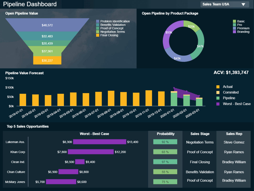
**click to enlarge**
The example above is the perfect representation of how analytical reports can boost a business’s performance. By getting detailed information such as sales opportunities, a probability rate, as well as an accurate pipeline value forecast based on historical data, sales teams can prepare their strategies in advance, tackle any inefficiencies, and make informed decisions for increased efficiency.
3. Operational Reports
These reports track every pertinent detail of the company's operational tasks, such as its production processes. They are typically short-term reports as they aim to paint a picture of the present. Businesses use this type of report to spot any issues and define their solutions or to identify improvement opportunities to optimize their operational efficiency. Operational reports are commonly used in manufacturing, logistics, and retail as they help keep track of inventory, production, and costs, among others.
4. Product Reports
As its name suggests, this report type is used to monitor several aspects related to product development. Businesses often use them to track which of their products or subscriptions are selling the most within a given time period, calculate inventories, or see what kind of product the client values the most. Another common use case of these reports is to research the implementation of new products or develop existing ones. Let’s see it in more detail with a visual example.
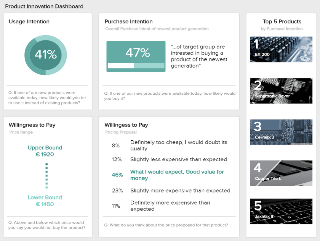
**click to enlarge**
The image above is a product report that shows valuable insights regarding usage intention, purchase intention, willingness to pay, and more. In this case, the report is based on the answers from a survey that aimed to understand how the target customer would receive a new product. Getting this level of insights through this report type is very useful for businesses as it allows them to make smart investments when it comes to new products as well as set realistic pricing based on their client’s willingness to pay.
5. Industry Reports
Next in our list of the most common kinds of reports, we have industry-specific reports. Typically, these reports provide an overview of a particular industry, market, or sector with definitions, key trends, leading companies, and industry size, among others. They are particularly useful for businesses that want to enter a specific industry and want to learn how competitive it is or for companies who are looking to set performance benchmarks based on average industry values.
6. Department Reports
These reports are specific to each department or business function. They serve as a communication tool between managers and team members who must stay connected and work together for common goals. Whether it is the sales department, customer service, logistics, or finances, this specific report type helps track and optimize strategies on a deeper level. Let’s look at it with an example of a team performance report.

**click to enlarge**
The image above is a department report created with an online data analysis tool, and it tracks the performance of a support team. This insightful report displays relevant metrics such as the top-performing agents, net promoter score, and first contact resolution rate, among others. Having this information in hand not only helps each team member to keep track of their individual progress but also allows managers to understand who needs more training and who is performing at their best.
7. Progress Reports
From the brunch of informational reports, progress reports provide critical information about the status of a project. These reports can be produced on a daily, weekly, or monthly basis by employees or managers to track performance and fine-tune tasks for the better development of the project. Progress reports are often used as visual materials to support meetings and discussions. A good example is a KPI scorecard.
8. Internal Reports
A type of report that encompasses many others on this list, internal reports refer to any type of report that is used internally in a business. They convey information between team members and departments to keep communication flowing regarding goals and business objectives.
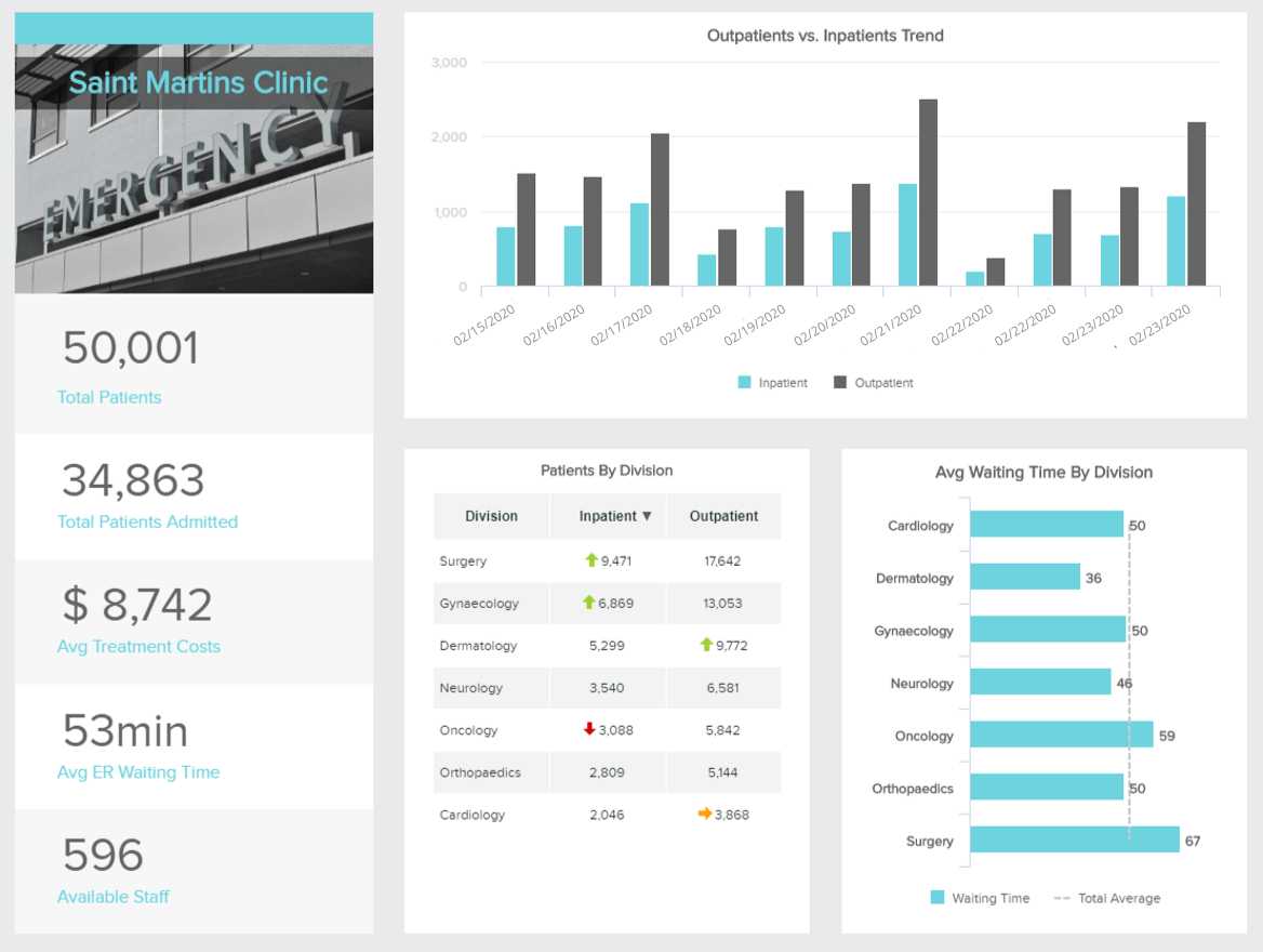
**click to enlarge**
As mentioned above, internal reports are useful communication tools to keep every relevant person in the organization informed and engaged. This healthcare report aims to do just that. By providing insights into the performance of different departments and areas of a hospital, such as in and outpatients, average waiting times, treatment costs, and more, healthcare managers can allocate resources and plan the schedule accurately, as well as monitor any changes or issues in real-time.
9. External Reports
Although most of the reports types listed here are used for internal purposes, not all reporting is meant to be used behind closed doors. External reports are created to share information with external stakeholders such as clients or investors for budget or progress accountability, as well as to governmental bodies to stay compliant with the law requirements.
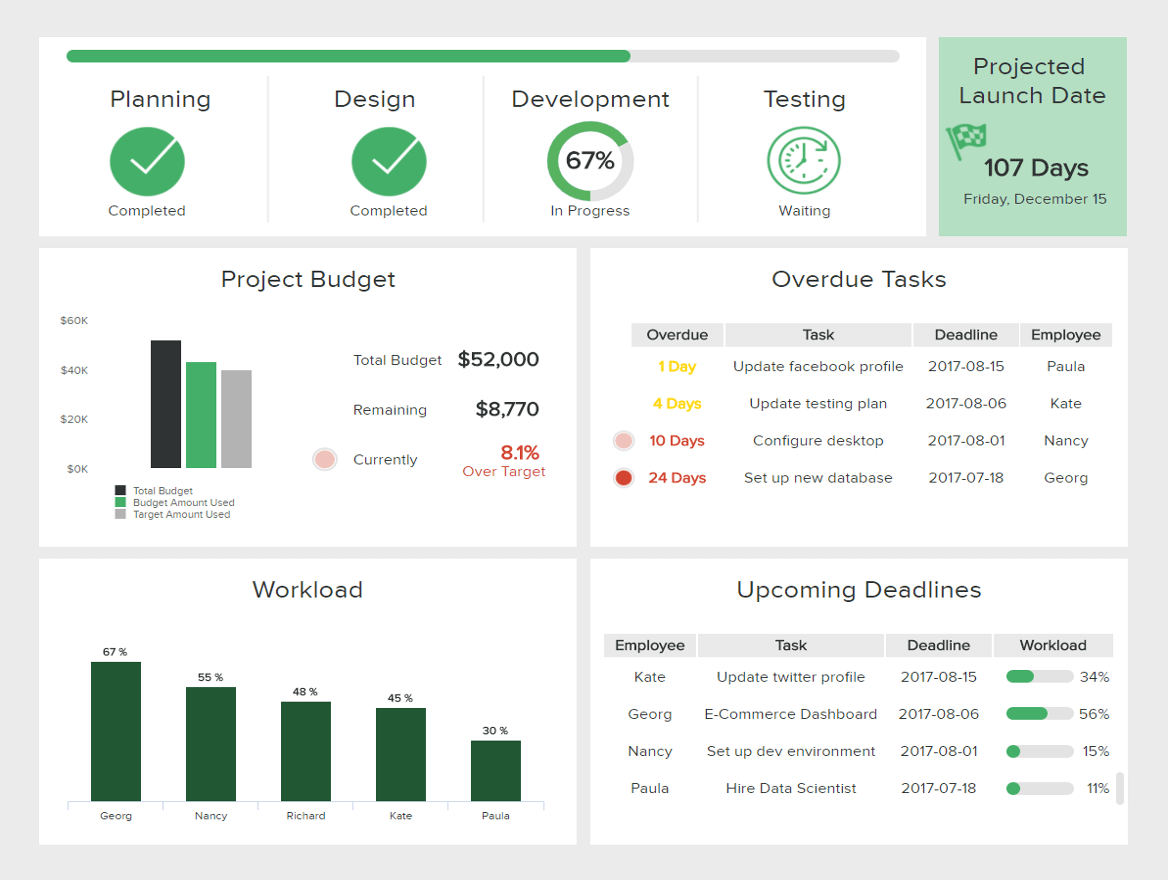
**click to enlarge**
The image above is the perfect example of an external client report from an IT project. This insightful report provides a visual overview of every relevant aspect of the project's development. From deadlines, budget usage, completion stage, and task breakdown, clients can be fully informed and involved in the project.
10. Vertical & Lateral Reports
Next, in our rundown of types of reports, we have vertical and lateral reports. This reporting type refers to the direction in which a report travels. A vertical report is meant to go upward or downward the hierarchy, for example, a management report. A lateral report assists in organization and communication between groups that are at the same level of the hierarchy, such as the financial and marketing departments.
11. Research Reports
Without a doubt, one of the most vital reporting types for any modern business is centered on research. Being able to collect, collate, and drill down into insights based on key pockets of your customer base or industry will give you the tools to drive innovation while meeting your audience’s needs head-on.
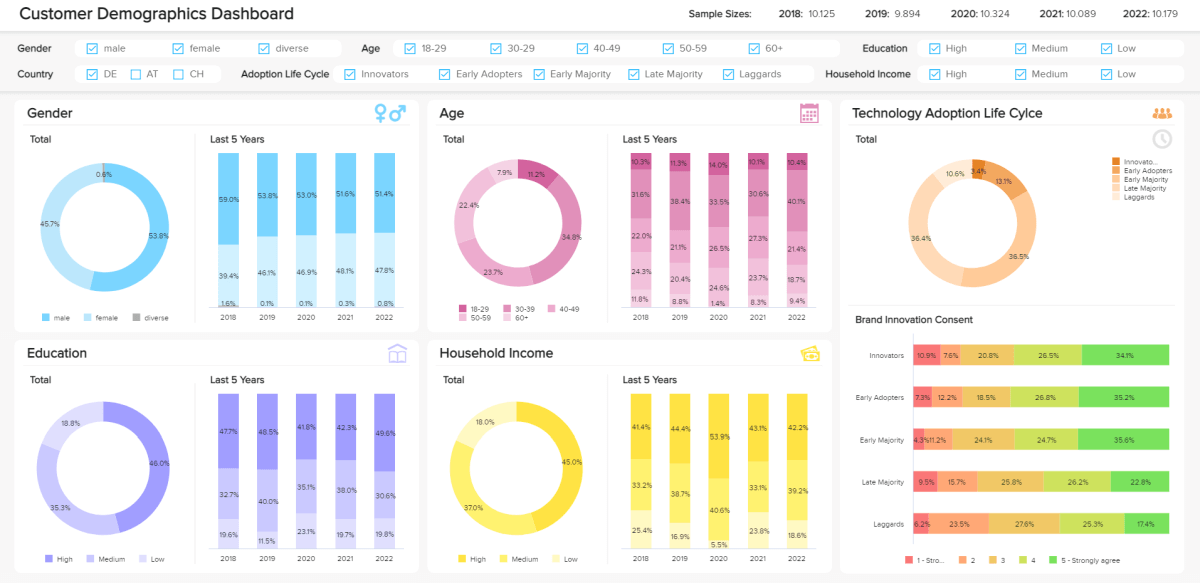
**click to enlarge**
The image above is a market research analytics report example for customer demographics. It serves up a balanced blend of metrics that will empower you to boost engagement as well as retention rates. Here, you can drill down into your audience’s behaviors, interests, gender, educational levels, and tech adoption life cycles with a simple glance.
What’s particularly striking about this dashboard is the fact that you can explore key trends in brand innovation with ease, gaining a working insight into how your audience perceives your business. This invaluable type of report will help you get under the skin of your consumers, driving growth and loyalty in the process.
12. Strategic Reports
Strategy is a vital component of every business, big or small. Strategic analytics tools are perhaps the broadest and most universal of all the different types of business reports imaginable.
These particular tools exist to help you understand, meet, and exceed your most pressing organizational goals consistently by serving up top-level metrics on a variety of initiatives or functions.
By working with strategic-style tools, you will:
- Improve internal motivation and engagement
- Refine your plans and strategies for the best possible return on investment (ROI)
- Enhance internal communication and optimize the way your various departments run
- Create more room for innovation and creative thinking
13. Project Reports
Projects are key to keeping a business moving in the right direction while keeping innovation and evolution at the forefront of every plan, communication, or campaign. But without the right management tools, a potentially groundbreaking project can become a resource-sapping disaster.
A project management report serves as a summary of a particular project's status and its various components. It's a visual tool that you can share with partners, colleagues, clients, and stakeholders to showcase your project's progress at multiple stages. Let’s look at our example and dig a little deeper.
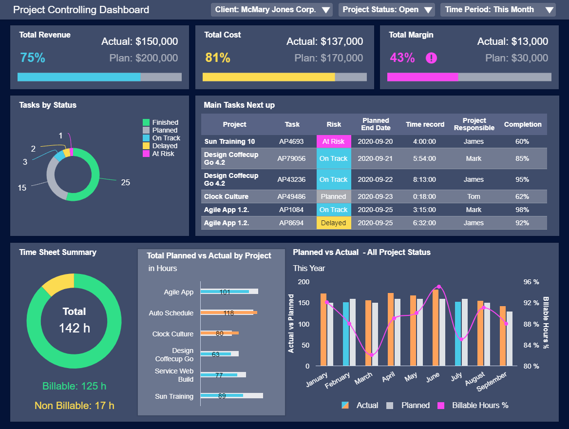
**click to enlarge**
To ensure consistent success across the board, the kinds of reports you must work with are based on project management.
Our example is a project management dashboard equipped with a melting pot of metrics designed to improve the decision-making process while keeping every facet of your company’s most important initiatives under control. Here, you can spot pivotal trends based on costs, task statuses, margins, costs, and overall project revenue. With this cohesive visual information at your fingertips, not only can you ensure the smooth end-to-end running of any key project, but you can also drive increased operational efficiency as you move through every significant milestone.
14. Statutory Reports
It may not seem exciting or glamorous, but keeping your business's statutory affairs in order is vital to your ongoing commercial health and success.
When it comes to submitting such vital financial and non-financial information to official bodies, one small error can result in serious repercussions. As such, working with statutory types of report formats is a water-tight way of keeping track of your affairs and records while significantly reducing the risk of human error.
Armed with interactive insights and dynamic visuals, you will keep your records clean and compliant while gaining the ability to nip any potential errors or issues in the bud.
Try our 14-day free trial & start building interactive reports today!
What Does A Report Look Like?
Now that we’ve covered the most relevant types of reports, we will answer the question: what does a report look like?
As mentioned at the beginning of this insightful guide, static reporting is a thing of the past. With the rise of modern technologies like self-service BI tools, the use of interactive reports in the shape of business dashboards has become more and more popular among companies.
Unlike static reports that take time to be generated and are difficult to understand, modern reporting tools are intuitive. Their visual nature makes them easy to understand for any type of user, and they provide businesses with a central view of their most important performance indicators for an improved decision-making process. Here, we will cover 20 useful dashboard examples from different industries, functions, and platforms to put the value of dashboard reporting into perspective.
1. Financial Report
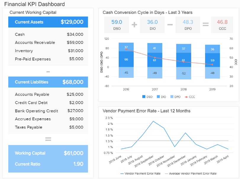
**click to enlarge**
Keeping finances in check is critical for success. This financial report offers an overview of the most important financial metrics that a business needs to monitor its economic activities and answer vital questions to ensure healthy finances.
With insights about liquidity, invoicing, budgeting, and general financial stability, managers can extract long and short-term conclusions to reduce inefficiencies, make accurate forecasts about future performance, and keep the overall financial efficiency of the business flowing. For instance, getting a detailed calculation of the business's working capital can allow you to understand how liquid your company is. If it's higher than expected, it means you have the potential to invest and grow—definitely, one of the most valuable types of finance reports.
2. Marketing Report
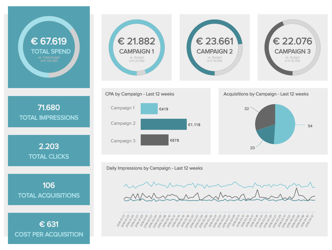
**click to enlarge**
Our following example is a marketing report that ensures a healthy return on investment from your marketing efforts. This type of report offers a detailed overview of campaign performance over the last 12 weeks. Having access to this information enables you to maximize the value of your promotional actions, keeping your audience engaged by providing a targeted experience.
For instance, you can implement different campaign formats as a test and then compare which one is most successful for your business. This is possible thanks to the monitoring of important marketing metrics such as the click-through rate (CTR), cost per click (CPC), cost per acquisition (CPA), and more.
The visual nature of this report makes it easy to understand important insights at a glance. For example, the four gauge charts at the top show the total spending from all campaigns and how much of the total budget of each campaign has been used. In just seconds, you can see if you are on target to meet your marketing budgets for every single campaign.
3. Sales Report
**click to enlarge**
An intuitive sales dashboard like the one above is the perfect analytical tool to monitor and optimize sales performance. Armed with powerful high-level metrics, this report type is especially interesting for managers, executives, and sales VPs as it provides relevant information to ensure strategic and operational success.
The value of this sales report lies in the fact that it offers a complete and comprehensive overview of relevant insights needed to make smart sales decisions. For instance, at the top of an analysis tool, you get important metrics such as the number of sales, revenue, profit, and costs, all compared to a set target and to the previous time period. The use of historical data is fundamental when building successful sales strategies as they provide a picture of what could happen in the future. Being able to filter the key metrics all in one screen is a key benefit of modern reporting.
4. HR Report
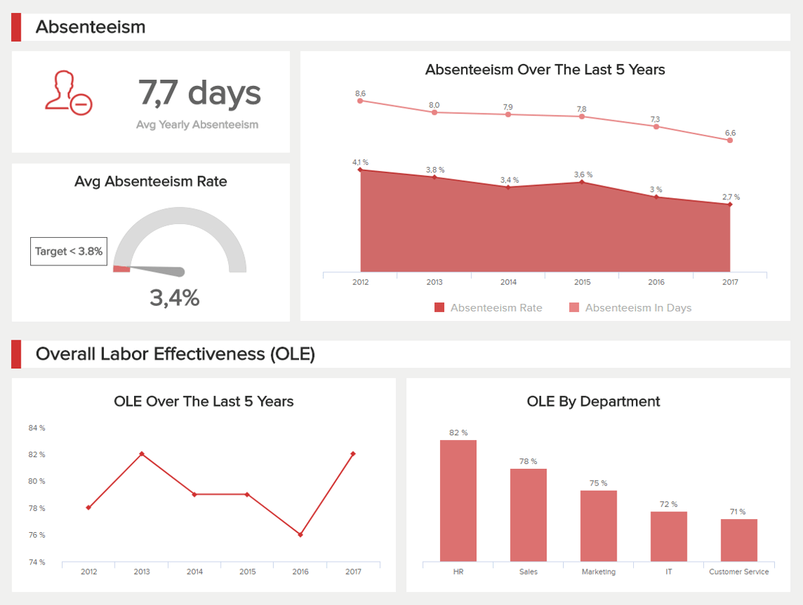
**click to enlarge**
Our next example of a report is about human resources analytics. The HR department needs to track various KPIs for employee performance and effectiveness. But overall, they have to ensure that employees are happy and working in a healthy environment since an unhappy workforce can significantly damage an organization. This is all possible with the help of this intuitive dashboard.
Providing a comprehensive mix of metrics, this employee-centric report drills down into every major element needed to ensure successful workforce management. For example, the top portion of the dashboard covers absenteeism in 3 different ways: yearly average, absenteeism rate with a target of 3.8%, and absenteeism over the last five years. Tracking absenteeism rates in detail is helpful as it can tell you if your employees are skipping work days. If the rate is over the expected target, then you have to dig deeper into the reasons and find sustainable solutions.
On the other hand, the second part of the dashboard covers the overall labor effectiveness (OLE). This can be tracked based on specific criteria that HR predefined, and it helps them understand if workers are achieving their targets or if they need extra training or help.
5. Management Report
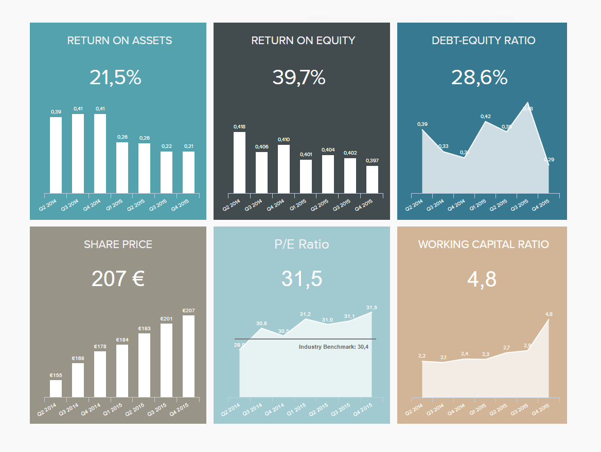
**click to enlarge**
Managers must monitor big amounts of information to ensure that the business is running smoothly. One of them being investor relationships. This management dashboard focuses on high-level metrics that shareholders need to look at before investing, such as the return on assets, return on equity, debt-equity ratio, and share price, among others.
By getting an overview of these important metrics, investors can easily extract the needed information to make an informed decision regarding an investment in your business. For instance, the return on assets measures how efficiently are the company's assets being used to generate profit. With this information, investors can understand how effectively your company deploys available resources compared to others in the market. Another great indicator is the share price; the higher the increase in your share price, the more money your shareholders are making from their investment.
6. IT Report
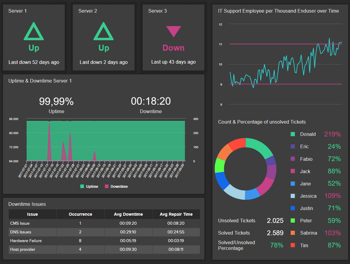
**click to enlarge**
Just like all the other departments and sections covered in this list, the IT department is one that can especially benefit from these types of reports. With so many technical issues to solve, the need for a visual tool to help IT specialists stay on track with their workload becomes critical.
As seen in the image above, this IT dashboard offers detailed information about different system indicators. For starters, we get a visual overview of the status of each server, followed by a detailed graph displaying the uptime & downtime of each week. This is complemented by the most common downtown issues and some ticket management information. Getting this level of insight helps your IT staff to know what is happening and when it is happening and find proper solutions to prevent these issues from repeating themselves. Keeping constant track of these metrics will ensure robust system performance.
7. Procurement Report
**click to enlarge**
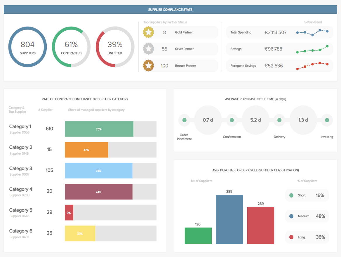
The following example of a report was built with intuitive procurement analytics software, and it gives a general view of various metrics that the procurement department needs to work with regularly.
With the possibility to filter, drill down, and interact with KPIs, this intuitive procurement dashboard offers key information to ensure a healthy supplier relationship. With metrics such as compliance rate, the number of suppliers, or the purchase order cycle time, the procurement team can classify the different suppliers, define the relationship each of them has with the company, and optimize processes to ensure it stays profitable.
8. Customer Service Report
**click to enlarge**
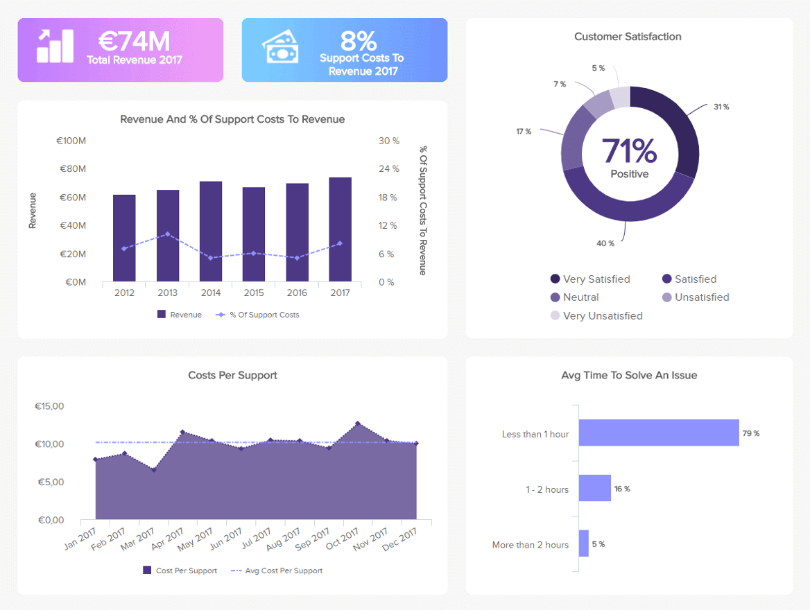
Following our list of examples of reports is one from the support area. Armed with powerful customer service KPIs, this dashboard is a useful tool to monitor performance, spot trends, identify strengths and weaknesses, and improve the overall effectiveness of the customer support department.
Covering aspects such as revenue and costs from customer support as well as customer satisfaction, this complete analysis tool is the perfect tool for managers who have to keep an eye on every little detail from a performance and operational perspective. For example, by monitoring your customer service costs and comparing them to the revenue, you can understand if you are investing the right amount into your support processes. This can be directly related to your agent’s average time to solve issues; the longer it takes to solve a support ticket, the more money it will cost and the less revenue it will bring. If you see that your agents are taking too long to solve an issue, you can think of some training instances to help them reduce this number.
9. Market Research Report
**click to enlarge**
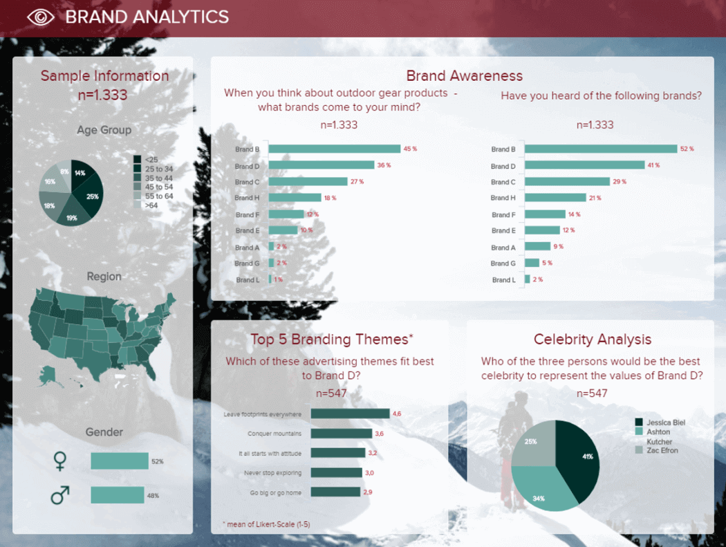
This list of report types examples would not be complete without a market research report. Market research agencies deal with a large amount of information coming from surveys and other research sources. Taking all this into account, the need for reports that can be filtered for deeper interaction becomes more necessary for this industry than any other.
The image above is a brand analytics dashboard that displays the survey results about how the public perceives a brand. This savvy tool contains different charts that make it easy to understand the information visually. For instance, the map chart with the different colors lets you quickly understand in which regions each age range is located. The charts can be filtered further to see the detailed answers from each group for a deeper analysis.
10. Social Media Report
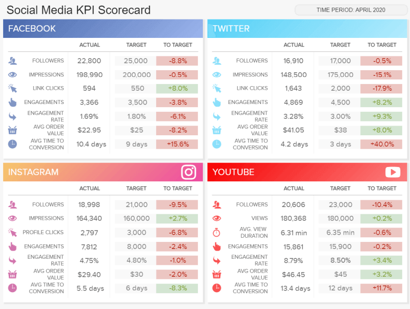
**click to enlarge**
Last but not least, we have a social media report. This scorecard format dashboard monitors the performance of 4 main social media channels: Facebook, Twitter, Instagram, and YouTube, and it serves as a perfect visual overview to track the performance of different social media efforts and achievements.
Tracking relevant metrics such as followers, impressions, clicks, engagement rates, and conversions, this report type serves as a perfect progress report to show to managers or clients who need to see the status of their social channels. Each metric is shown in its actual value and compared to a set target. The colors green and red from the fourth column let you quickly understand if a metric is over or under its expected target.
11. Logistics Report
Logistics are the cornerstone of an operationally fluent and progressive business. If you deal with large quantities of goods and tangible items, in particular, maintaining a solid logistical strategy is vital to ensuring you maintain your brand reputation while keeping things flowing in the right direction.
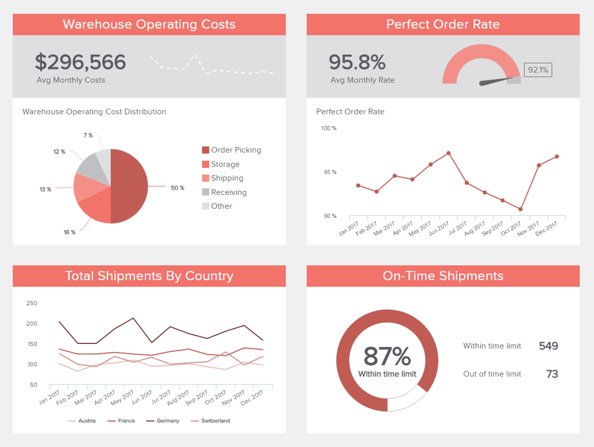
**click to enlarge**
A prime example of the types of data reporting tool designed to improve logistical management, our warehouse KPI dashboard is equipped with metrics required to maintain strategic movement while eliminating any unnecessary costs or redundant processes. Here, you can dig into your shipping success rates across regions while accessing warehouse costs and perfect order rates in real-time. If you spot any potential inefficiencies, you can track them here and take the correct course of action to refine your strategy. This is an essential tool for any business with a busy or scaling warehouse.
Try our 14-day free trial & start building interactive reports today!
12. Manufacturing Report
Next, in our essential types of business reports examples, we’re looking at tools made to improve your business’s various manufacturing processes.
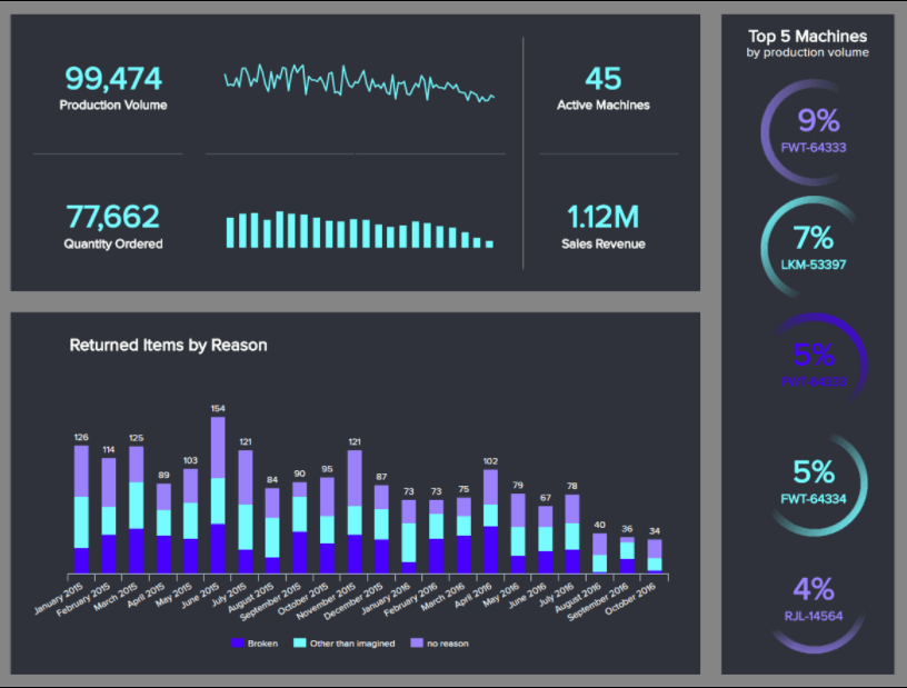
**click to enlarge**
Our clean and concise production tool is a sight to behold and serves up key manufacturing KPIs that improve the decision-making process regarding costs, volume, and machinery.
Here, you can hone in on historical patterns and trends while connecting with priceless real-time insights that will not only help you make the right calls concerning your manufacturing process at the moment but will also help you formulate predictive strategies that will ultimately save money, boost productivity, and result in top-quality products across the board.
13. Retail Report
As a retailer with so many channels to consider and so many important choices to make, working with the right metrics and visuals is absolutely essential. Fortunately, we live in an age where there are different types of reporting designed for this very reason.
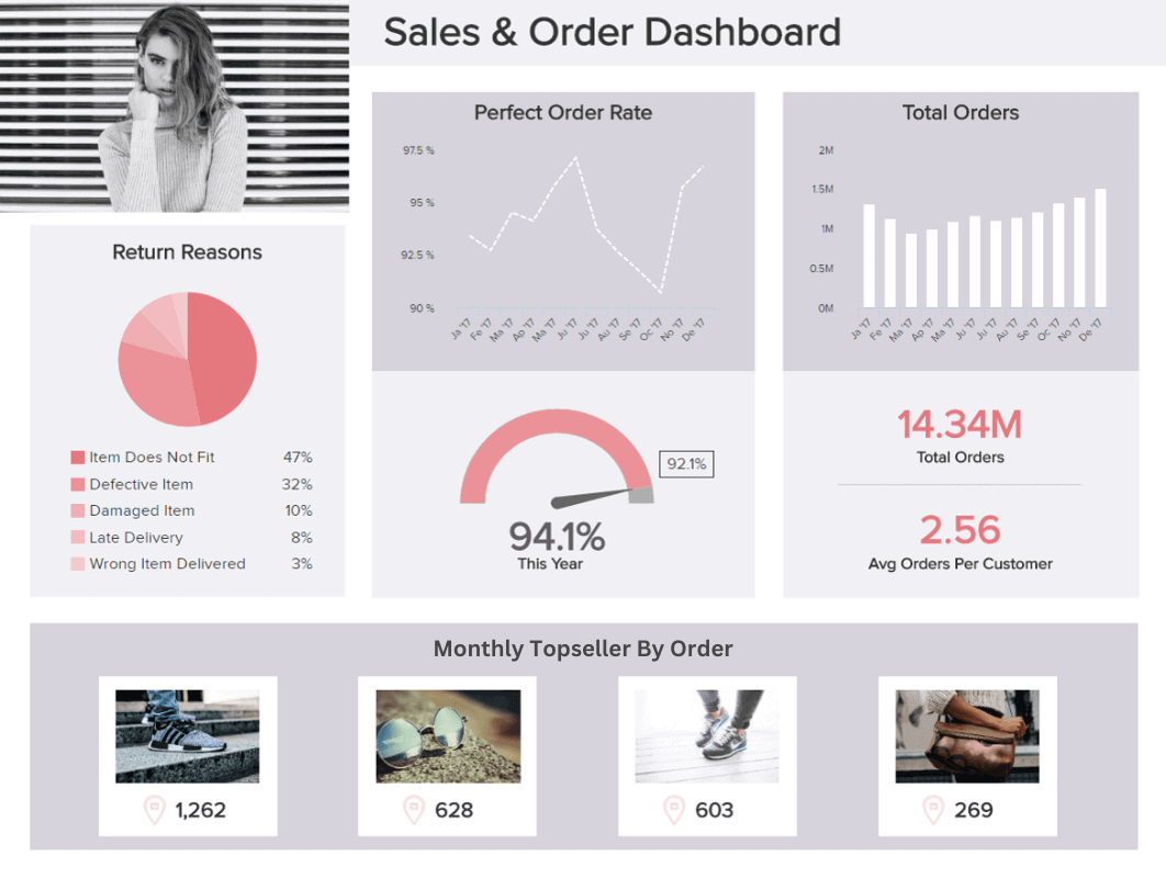
**click to enlarge**
Our sales and order example, generated with retail analytics software, is a dream come true for retailers as it offers the visual insights needed to understand your product range in greater detail while keeping a firm grip on your order volumes, perfect order rates, and reasons for returns.
Gaining access to these invaluable insights in one visually presentable space will allow you to track increases or decreases in orders over a set timeframe (and understand whether you’re doing the right things to drive engagement) while plowing your promotional resources into the products that are likely to offer the best returns.
Plus, by gaining an accurate overview of why people are returning your products, you can omit problem items or processes from your retail strategy, improving your brand reputation as well as revenue in the process.
14. Digital Media Report
The content and communications you publish are critical to your ongoing success, regardless of your sector, niche, or specialty. Without putting out communications that speak directly to the right segments of your audience at the right times in their journey, your brand will swiftly fade into the background.
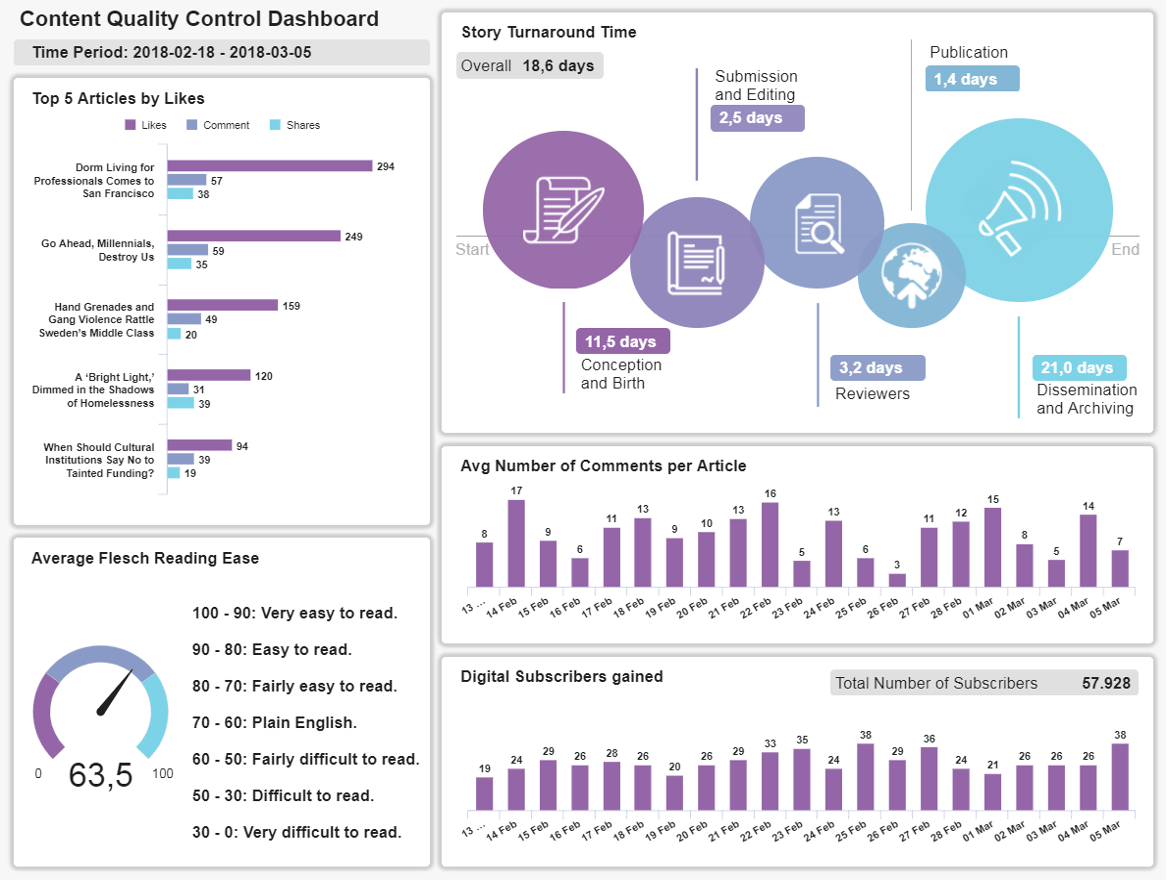
**click to enlarge**
To ensure your brand remains inspiring, engaging, and thought-leading across channels, working with media types of a business report is essential. You must ensure your communications cut through the noise and scream ‘quality’ from start to finish—no ifs, no buts, no exceptions.
Our content quality control tool is designed with a logical hierarchy that will tell you if your content sparks readership, if the language you’re using is inclusive and conversational, and how much engagement-specific communications earn. You can also check your most engaged articles with a quick glance to understand what your users value most. Armed with this information, you can keep creating content that your audience loves and ultimately drives true value to the business.
15. Energy Report
In the age of sustainability and in the face of international fuel hikes, managing the energy your business uses effectively is paramount. Here, there is little room for excess or error, and as such, working with the right metrics is the only way to ensure successful energy regulation.
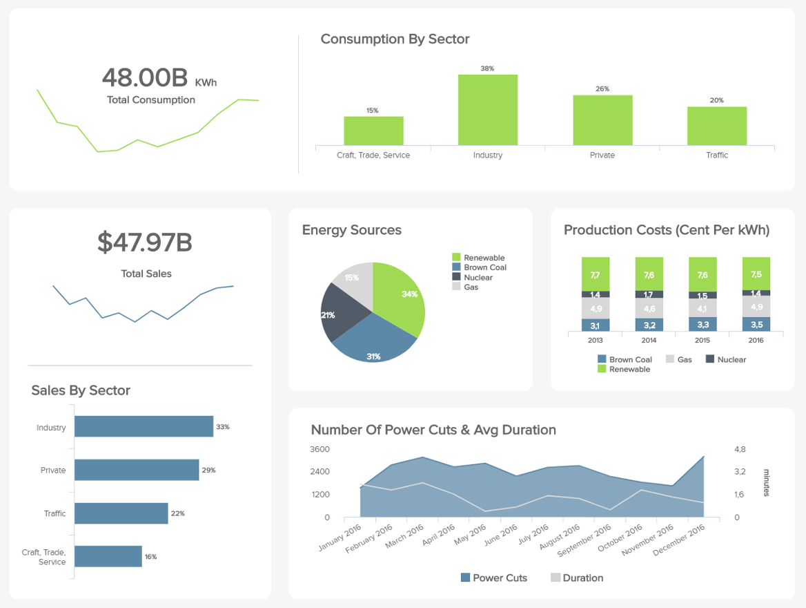
**click to enlarge**
If your company has a big HQ or multiple sites that require power, our energy management analytics tool will help you take the stress out of managing your resources. One of the most striking features of this dashboard is the fact that it empowers you to compare your company’s energy usage against those from other sectors and set an accurate benchmark.
Here, you can also get a digestible breakdown of your various production costs regarding energy consumption and the main sources you use to keep your organization running. Regularly consulting these metrics will not only help you save colossal chunks of your budget, but it will also give you the intelligence to become more sustainable as an organization. This, in turn, is good for the planet and your brand reputation—a real win-win-win.
16. FMCG Report
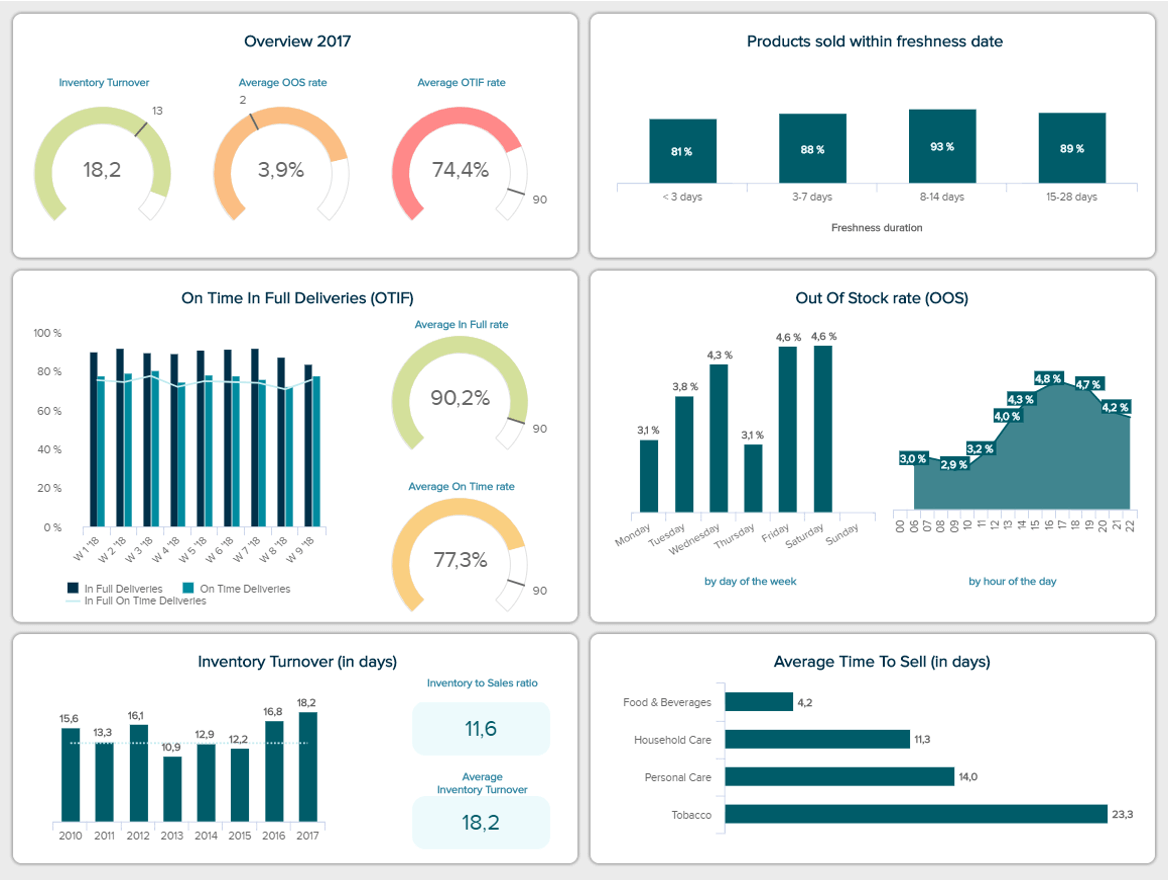
**click to enlarge**
The fast-moving consuming goods (FMCG) industry can highly benefit from a powerful report containing real-time insights. This is because the products handled in this sector which are often food and beverages, don’t last very long. Therefore, having a live overview of all the latest developments can help decision-makers optimize the supply chain to ensure everything runs smoothly and no major issues happen.
Our report format example above aims to do just that by providing an overview of critical performance indicators, such as the percentage of products sold within freshness date, the out-of-stock rate, on-time in full deliveries, inventory turnover, and more. What makes this template so valuable is the fact that it provides a range of periods to get a more recent view of events but also a longer yearly view to extract deeper insights.
The FMCG dashboard also offers an overview of the main KPIs to help users understand if they are on the right track to meet their goals. There, we can observe that the OTIF is far from its target of 90%. Therefore, it should be looked at in more detail to optimize it and prevent it from affecting the entire supply chain.
17. Google Analytics Report

**click to enlarge**
Regardless of the industry you are in, if you have a website then you probably require a Google Analytics report. This powerful tool helps you understand how your audience interacts with your website while helping you reach more people through the Google search engine. The issue is that the reports the tool provides are more or less basic and don’t give you the dynamic and agile view you need to stay on top of your data and competitors.
For that reason, at datapine, we generated a range of Google Analytics dashboards that take your experience one step further by allowing you to explore your most important KPIs in real-time. That way, you’ll be able to spot any potential issues or opportunities to improve as soon as they occur, allowing you to act on them on the spot.
Among some of the most valuable metrics you can find in this sample are the sessions and their daily, weekly, and monthly development, the average session duration, the bounce rate by channel and by top 5 countries, among others.
18. YouTube Report
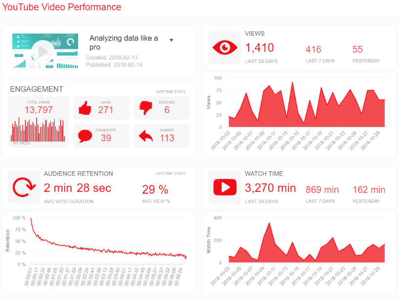
**click to enlarge**
So far, we’ve covered examples for various industries and sectors. Now, we will dive a bit deeper into some templates related to popular platforms businesses use in their daily operations. With the rise in video-related content, we could not leave YouTube outside of the list. This popular platform hides some valuable insights that can help you improve your content for your current audience but also reach new audiences that can be interested in your products or services.
This highly visual and dynamic sample offers an interactive view of relevant KPIs to help you understand every aspect of your video performance. The template can be filtered for different videos to help you understand how each type of content performs. For instance, you get an overview of engagement metrics, such as likes, dislikes, comments, and shares, that way, you can understand how your audience interacts with your content.
Additionally, you also get more detailed charts about the number of views, the average watch time per day, and audience retention. These indicators can help you understand if something needs to be changed. For instance, audience retention goes down a lot after one minute and a half. Therefore you either need to make sure you are making the rest of the video a bit more interesting or offering your product or service or any other relevant information in the first minute.
19. LinkedIn Report
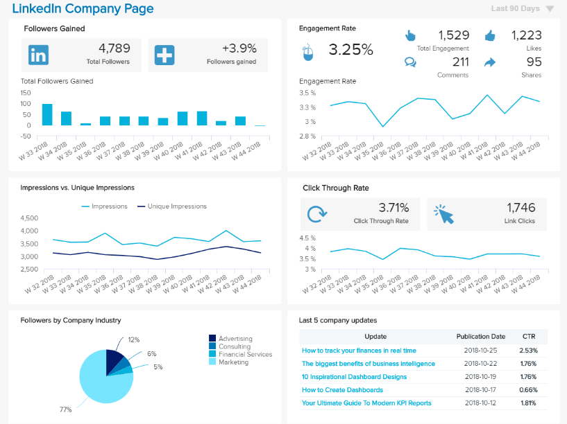
**click to enlarge**
Another very important platform that companies use, no matter their size or industry, is LinkedIn. This platform is the place where companies develop and showcase their corporate image, network with other companies, and tell their clients and audience about the different initiatives they are developing to grow and be better. Some organizations also use LinkedIn to showcase their charity or sustainability initiatives.
The truth is LinkedIn has become an increasingly relevant platform, and just like we discussed with YouTube, organizations need to analyze data to ensure their strategies are on the right path to success.
The template above offers a 360-degree view of a company page's performance. With metrics such as the followers gained, engagement rate, impressions vs unique impressions, CTR, and more. Decision-makers can dive deeper into the performance of their content and understand what their audience enjoys the most. For instance, by looking at the CTR of the last 5 company updates, you can start to get a sense of what topics and content format your audience on the platforms interact with the most. That way, you’ll avoid wasting time and resources producing content without interaction.
20. Healthcare Report

**click to enlarge**
Moving on from platform-related examples, we have one last monthly report template from a very relevant sector, the healthcare industry. For decades now, hospitals and healthcare professionals have benefited from data to develop new treatments and analyze unknown diseases. But, data can also help to ensure daily patient care is of top quality.
Our sample above is a healthcare dashboard report that tracks patient satisfaction stats for a clinic named Saint Martins Clinic. The template provides insights into various aspects of patient care that can affect their satisfaction levels to help spot any weak areas.
Just by looking at the report in a bit more detail, we can already see that the average waiting time for arrival to a bed and time to see a doctor are on the higher side. This is something that needs to be looked into immediately, as waiting times are the most important success factors for patients. Additionally, we can see those lab test turnarounds are also above target. This is another aspect that should be optimized to prevent satisfaction levels from going down.
If you feel inspired by this list and want to see some of the best uses for business reports, then we recommend you take a look at our dashboard examples library, where you will find over 80+ templates from different industries, functions, and platforms for extra inspiration!
What You Should Look For In A Reporting Tool
As you learned from our extensive list of examples, different types of reports are widely used across industries and sectors. Now, you might wonder, how do I get my hands on one of these reports? The answer is a professional online reporting tool. With the right software in hand, you can generate stunning reports to extract the maximum potential out of your data and boost business growth in the process.
But, with so many options in the market, how do make sure you choose the best tool for your needs? Below we cover some of the most relevant features and capabilities you should look for to make the most out of the process.
- Pre-made reporting templates
To ensure successful operations, a business will most likely need to use many types of reports for its internal and external strategies. Manually generating these reports can become a time-consuming task that burdens the business. That is why professional reporting software should offer pre-made reporting templates. At datapine, we offer an extensive template library that allows users to generate reports in a matter of seconds—allowing them to use their time on actually analyzing the information and extracting powerful insights from it.
- Multiple visualization options
If you look for report templates on Google you might run into multiple posts about written ones. This is not a surprise, as written reports have been the norm for decades. That being said, a modern approach to reporting has developed in the past years where visuals have taken over text. The value of visuals lies in the fact that they make the information easier to understand, especially for users who have no technical knowledge. But most importantly, they make the information easier to explore by telling a compelling story. For that reason, the tool you choose to invest in should provide you with multiple visualization options to have the flexibility to tell your data story in the most successful way possible.
- Customization
While pre-made templates are fundamental to generating agile reports, being able to customize them to meet your needs is also of utmost importance. At datapine, we offer our users the possibility to customize their reports to fit their most important KPIs, as well as their logo, business colors, and font. This is an especially valuable feature for external reports that must be shown to clients or other relevant stakeholders, giving your reports a more professional look. Customization can also help from an internal perspective to provide employees who are uncomfortable with data with a familiar environment to work in.
- Real-time insights
In the fast-paced world we live in today, having static reports is not enough. Businesses need to have real-time access to the latest developments in their data to spot any issues or opportunities as soon as they occur and act on them to ensure their resources are spent smartly and their strategies are running as expected. Doing so will allow for agile and efficient decision-making, giving the company a huge competitive advantage.
- Sharing capabilities
Communication and collaboration are the basis of a successful reporting process. Today, team members and departments need to be connected to ensure everyone is on the right path to achieve general company goals. That is why the tool you invest in should offer flexible sharing capabilities to ensure every user can access the reports. For instance, at datapine, we offer our users the possibility to share reports through automated emails or password-protected URLs with viewing or editing rights depending on what data the specific user can see and manipulate. A great way to keep everyone connected and boost collaboration.
Try our 14-day free trial & start building interactive reports today!
Types Of Reporting For Every Business & Purpose
As we’ve seen throughout our journey, different report formats are used by businesses for diverse purposes in their everyday activities. Whether you’re talking about types of reports in research, types of reports in management, or anything in between, these dynamic tools will get you where you need to be (and beyond).
In this post, we covered the top 14 most common ones and explored key examples of how different report types are changing the way businesses are leveraging their most critical insights for internal efficiency and, ultimately, external success.
With modern tools and solutions, reporting doesn’t have to be a tedious task. Anyone in your organization can rely on data for their decision-making process without needing technical skills. Rather, you want to keep your team connected or show progress to investors or clients. There is a report type for the job. To keep your mind fresh, here are the top 14 types of data reports covered in this post:
- Informational reports
- Analytical reports
- Operational reports
- Product reports
- Industry reports
- Department reports
- Progress reports
- Internal reports
- External reports
- Vertical and lateral reports
- Strategic reports
- Research reports
- Project reports
- Statutory reports
Now, over to you. Are you ready? If you want to start building your own types of reports and get ahead of the pack today, then you should try our BI reporting software for 14 days for free!