Do you know that 90% of the best-performing YouTube videos have custom thumbnails? It’s like with a book cover:
Thumbnails draw attention, attract views, and help viewers choose your video from the crowd of others.
Given the time and efforts you spend organizing and optimizing your video content, it would be doubly upsetting to miss views and rankings because of wrong “book covers,” aka poor YouTube thumbnails design, agree?
In this post, we’ll discuss the role of YouTube thumbnails in your video marketing success. You’ll also get tips on customizing them, including mistakes to avoid in YouTube thumbnails design.
What is a YouTube Thumbnail?
A YouTube thumbnail is an image a user sees when previewing a list of videos on your channel or in search results. Its goal is to engage potential viewers, enticing them to want to see more.
We call it a “thumbnail” because it works like a smaller version of a full image a viewer can see while browsing a number of digital images.
YouTube thumbnails serve to make users want to watch a video, provide them with an idea of what they’ll see in it, and present you as a professional.
If you don’t create and upload a thumbnail for your video, YouTube will randomly pick a shot from it and place it as a video cover. Often, such shots look unattractive or even awkward:
- They don’t provide any context for a user.
- They get lost in dozens or even hundreds of bright, eye-pleasing, and inviting thumbnails.
- They don’t represent you as an expert in the eyes of YouTube users. Even if you’re one, users won’t know it: Pale profile and unexpressive design will turn them away from choosing and watching your videos.
Sure, you can choose a thumbnail from the options YouTube gives. But, as far as you understand, it’s not an option for video makers and marketers willing to build brand awareness, trust, and loyalty of their target audience.
By designing a professional YouTube thumbnail, you build reputation, improve your channel’s brand, and attract visitors to watch your content.
7 Mistakes to Avoid in YouTube Thumbnails Design
That’s all well and fine, but how to design custom thumbnails for your YouTube videos so they would benefit your brand reputation and rankings? How to use this instrument as an opportunity to stand out from tons of videos on the same subject?
Here go the attributes of a good YouTube thumbnail:
- Eye-grabbing
- Conveying a video’s subject
- Easy-to-read
- Representing your brand identity: colors, logo, tone of voice, etc.
- Showing a person’s inviting face, when possible
- Optimized for any device
The above example has all these elements. A single image conveys tons of information for viewers to decide if this video is right for them.
To make yours serve like this, ensure you don’t make the most common mistakes when designing thumbnails for your videos. Below are seven mistakes to avoid, together with tips on customizing stellar YouTube thumbnails for your channel.
1) Wrong Size
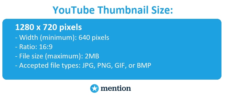
While thumbnails look small in YouTube search results, please remember there can also be embedded videos. It’s a mistake to make thumbnail images too small: It’s better to design a large image that can be scaled down than use a small image and sacrifice quality when it needs to be scaled up.
The ideal size for YouTube thumbnails is 1280×720 pixels with a 640 pixels width minimum. Along with the size, consider the ratio, file size, and file type of your thumbnail. Below are all the details:
When designing a thumbnail for YouTube videos, remember that many people will watch it from their mobile devices with small screens. Ensure you optimize all the elements accordingly: clear pictures, short text, and minimalistic design will help here.
More on that below.
2) Poor Color-Contrast Ratio
An image you use as a thumbnail’s background grabs attention and serves as a canvas to place text and other elements in it. So it’s critical to design everything for better usability and engagement. Let alone the fact YouTube thumbnails also work as your brand’s visual presentation, helping users recognize and distinguish your content from competitors.
Willing to stand out, some YouTubers continue making the same mistake:
They stuff thumbnails with many elements of different fonts, colors, and contrast. It’s exhausting for visitors to perceive, so they ignore such videos and go to other channels.
Tip: Use no more than three colors in your thumbnails design. The human brain retains three – elements, colors, and fonts – best, so a maximum of three variables is a sure-fire way to keep your thumbnail simple yet strong.
For example, it can be a few shades of your brand color. Like Neil Patel does with orange:

Another blunder here would be a poor color contrast.
Why do you think people hate all those red on blue or text content on crude background images? They look clumsy and hard to read, frustrating users tremendously!
When designing your thumbnail images, always ensure your text contrasts nicely with the background. Consider high contrast colors, with no less than a 5:1 color-contrast ratio.
A good practice would be to pick light, calming colors for backgrounds: They make it comfortable for visitors to see and read thumbnails on different devices.
That’s what Income School does with their thumbnails:

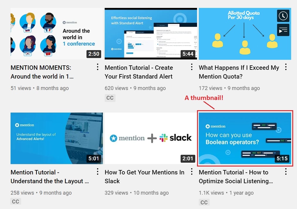
3) No Context
YouTube thumbnails engage users thanks to a powerful visualization. The oldy-moldy statistics about most people are visual beings perceiving images 60,000 times faster than text still works: A high-quality image, relevant to your video’s context, acts as a demo version of what users get after watching.
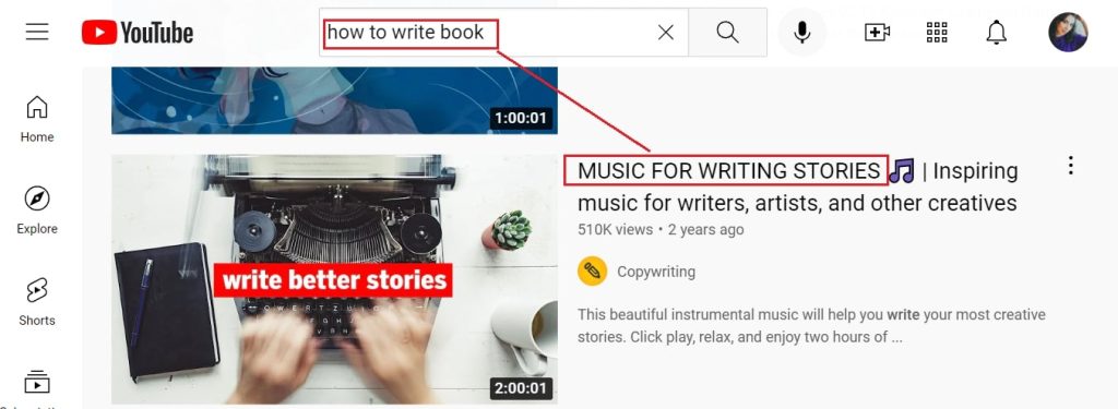
It’s also your opportunity, as a brand, to build trust and a community of loyal followers. So, it’s a big mistake to craft generic thumbnails with no context, like this one:
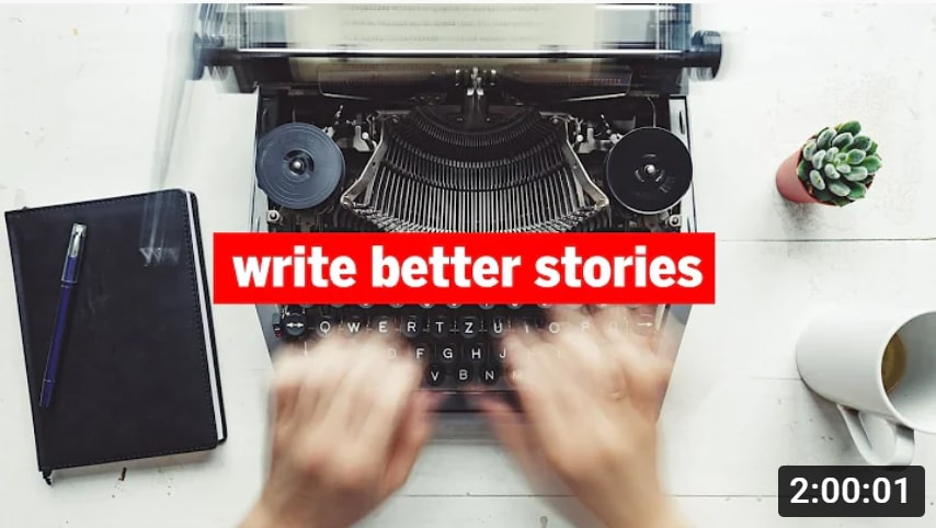
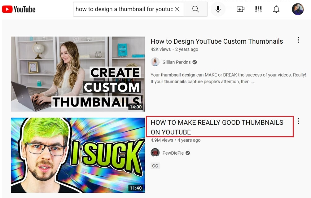
Can you guess the content inside of this video?
I’d say that it’s a tutorial with tips on how to write better, given that I’ve got this result when searching “how to write a book” on YouTube. However, it’s the list of instrumental music to inspire writers, which is not that relevant to what I expected.
So please ensure your thumbnail provides context and helps users understand what they’ll find inside if deciding to watch your video.
The best way to deliver context would be to include relevant title text in a thumbnail. It leads us to the following YouTube thumbnails design mistake:
4) No Title Text Or Wrong Text Font
A high-quality and relevant image matters, but it still can’t communicate the whole message. Two people may have two opposed associations when looking at the same picture, and it would be a mistake to leave them without further description.
For users to understand the exact purpose of your video, always add a title text to YouTube thumbnails.
Ensure it’s short, relevant to your video content, and with minimum linking words in it. Add active verbs and descriptive adjectives to your title to motivate users to click and watch. You can also give a bold style to your title for even more visibility and engagement.
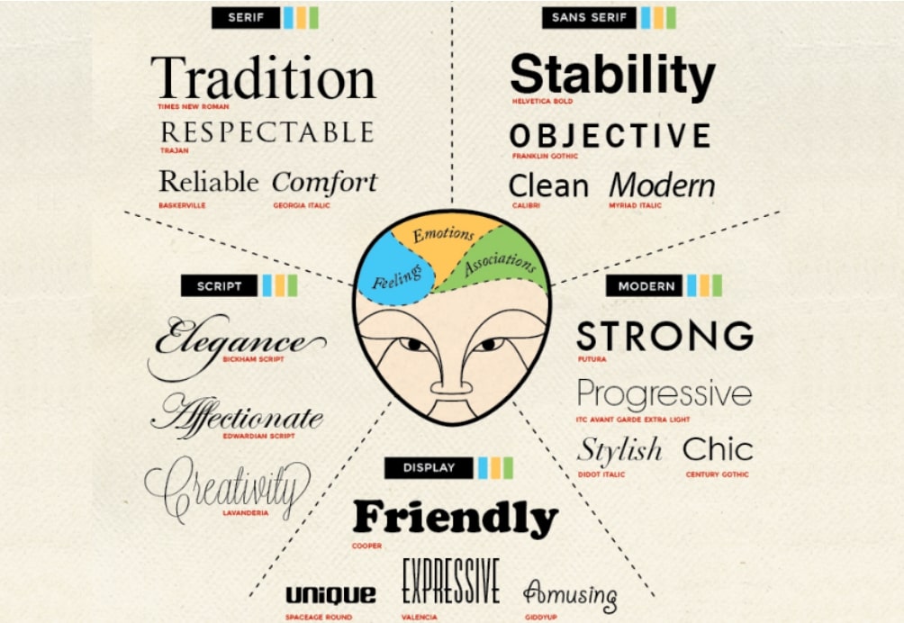
Avoid regular fonts most other YouTubers use. Consider something unique and impressive, something that would communicate the mood of your message and evoke a corresponding emotion from viewers.
The psychology of fonts can help here:
One more thing:
Keep title texts consistent. Use the same font and colors for all video thumbnails on your channel.
5) No Brand Identity in YouTube Thumbnails
How will users recognize your videos from tons of others in YouTube search results? What makes you stand out and helps the targets distinguish your brand from others?
It’s a style that reflects you and your business. You need to brand thumbnails according to your identity for followers to “catch” your videos at a glance.
For that, consider the same colors, fonts, and graphics you use on other marketing channels: your website, social media accounts, landing page, etc. YouTube thumbnails need to match your brand perfectly.
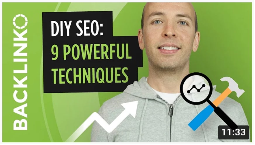
Like Brian Dean does:
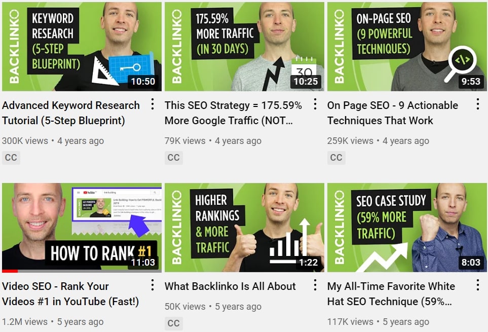
What do we have here?
- The green color we all know Backlinko for
- The logo
- Consistency in titles: font, colors, writing style
- Tiny graphic details in every thumbnail’s corner as an extra identifier of Brian’s niche and video topic
- Brian himself as a person behind the brand
Speaking of persons, by the way:
If you promote a personal brand or have a face behind it, it would be a great idea to include an image of the face in a thumbnail. Not only will it help users recognize your videos faster, but it will also build a stronger connection with viewers.
It’s nothing but human psychology again:
Studies prove that pictures with faces drive 38% more engagement. It happens because we can’t ignore eye gaze, therefore subconsciously reacting to an image with people in it. That’s why marketers recommend showing people behind products rather than displaying the product itself.
No surprise that most vloggers design YouTube thumbnails with their photos. The position of gaze in the picture, arrows, and pointing a finger are other instruments for evoking curiosity and attracting attention to a particular element of your thumbnail:
6) Clickbait
Be honest and accurate with YouTube thumbnails. Click baiting and misleading users will hurt your brand reputation and rankings:
- Visitors will leave your channel, seeing irrelevant content
- A bounce rate will grow
- It will be a signal for YouTube to stop showing your videos in search results because of irrelevancy
Here’s an example of a clickbait title:
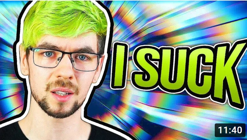
Yes, it’s bright and eye-grabbing, but it doesn’t have anything to do with the video content behind it. Could you imagine that a YouTuber would talk about making good thumbnails here?
Ensure your thumbnail gives context that will benefit, not harm, your video performance. Think of it as a teaser but don’t reveal too much to enhance users’ curiosity. It’s not that challenging to do, but, when in doubt, you can always hire dedicated developers or designers for more professional help with thumbnail design.
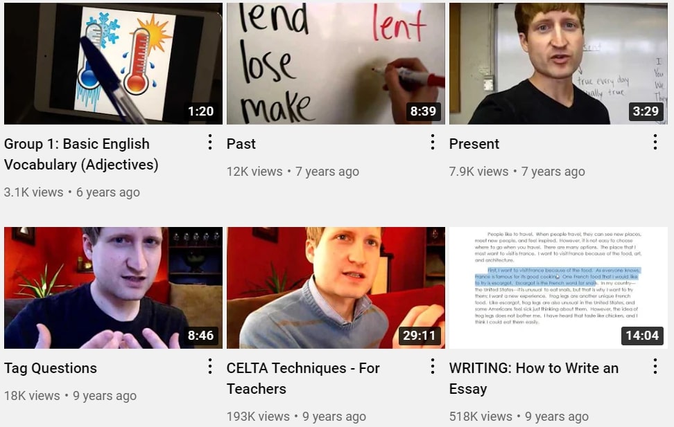
7) No consistency
Your YouTube channel needs a consistent style that will reflect you and your business. Consistency in thumbnail design serves your brand awareness and establishes you as a professional who cares about your content and audience.
Plus, it helps viewers understand the concept of your videos, visualize your brand character, and get your tone of voice.
Consistency in YouTube thumbnails design means using the same layouts, color schemes, fonts, and other relevant stuff to display the image of your brand. In a nutshell, try to avoid anything like this:
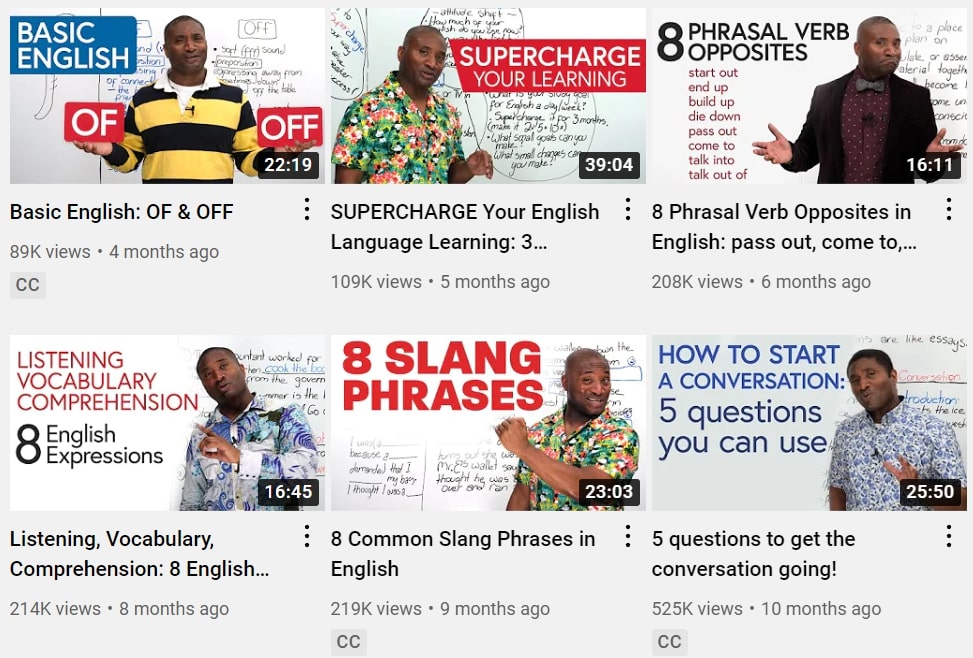
And focus on designing something like this instead:
Tip: If crafting a series of videos on the same topic, you can design a bunch of custom thumbnails so it would be easier for users to recognize them from others.
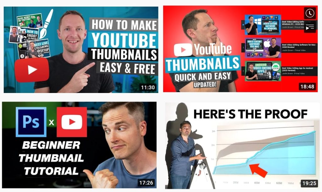
To save time designing a new thumbnail every time you get a video to share, consider the corresponding software:
Graphic design tools and YouTube thumbnail makers allow you to choose a branded template, adjust colors and fonts, change backgrounds, and add all the elements for a consistent display of your brand on YouTube.
Long Story Short
Now that you know the top mistakes vloggers and marketers make in YouTube thumbnails design, let’s recap some practical tips for avoiding them:
- Stay consistent with your thumbnail design.
- Remember about your brand identity to reflect in the thumbnail.
- Don’t stuff thumbnails with tons of colors, fonts, graphics, and other elements: Choose one font for titles, use up to three colors, and remember the color-contrast ratio for better usability.
- Always add a title text and context to your thumbnail; avoid clickbait.
- Consider the ideal size for YouTube thumbnails and stick to it.
YouTube thumbnails design is critical for branding your channel and engaging the audience. By optimizing the thumbnails of your personal or marketing videos accordingly, you can influence their visibility and rankings in YouTube search results.