Did you know that over 50% of users spend fewer than 15 seconds viewing a page? In fact, you have just around 50 milliseconds to make a good first impression on your landing page visitors.
During this time, your prospects are viewing the content, imagery, and web design of your page. Very few will read through the entirety of your content copy, in fact, most will only look at the imagery and color of your webpage.
This is because the human brain tends to process visual content a lot faster than words, around 60,000 times faster to be exact!
Color forms a huge part of your web design, they can make your content aesthetic and visually pleasing but they can also contribute to the way consumers interact with your products.
But hold up, how exactly does color affect consumer behavior?
Here are some powerful statistics that show just how important the psychology of color is when it comes to designing your landing pages.
- According to researchers, web-design, particularly the use of color, is 94% responsible for the cause of rejection and mistrust of websites. Comparatively, content only held a 6% weightage!
- According to Xerox, color helps boost brand recognition and sales by 80%.
- According to Kissmetrics, 85% of consumers state color as the primary reason why they purchase a particular product.
- Studies show that people interact and form an opinion about your product within the first 90 seconds and 62-90% of this assessment is based on color alone.

Color has a huge impact on our emotions, moods, and even our behavior. Colors can’t dictate consumer behavior but they can influence their decisions and moods. This is because color activates the hypothalamus – the part of your brain associated with emotions such as fear, rage, pleasure, etc.
Each color tends to focus on either your sympathetic or parasympathetic nervous system that evokes certain physiological and psychological reactions and if used right can influence consumer behavior.
Color psychology is now an emerging area of research that studies just how color can influence individual behavior and decision-making. Marketers leverage color psychology in the way their brand is perceived to invoke certain responses. After all, you have tons of competitors out there fishing for your prospects. So, how can you stand out to your visitors? Use the psychology of color!
Using color the right way can help you tap into your prospect’s moods and emotions and influence their buying decisions, which can in turn boost conversions for your website. Some colors tend to have the same impacts universally, whereas others don’t necessarily impact individuals of different gender, location, and even age the same way.
If we talk about colors that have universal meanings, then consider warm colors and cool colors.
Warm colors include red, orange, and yellow, and these tend to give people the feeling of warmth, comfort, anger, hostility. On the other hand, cool colors such as blue, purple, green tend to ignite a sense of calmness, trust, and relaxation.
Still aren’t sold on color psychology?
Adding color isn’t as simple as it seems; you need to study which colors evoke what response, in what way, and with which audience. Your focus should be on sending the right message to your target audience.
Table of Contents:
- Use Blue To Evoke Trust
- Use Red to Evoke Urgency
- Use Yellow and Orange For Optimism
- Use Green for peace and growth
- Use black for elegance and prestige
- Avoid Colour Overload: Use tons of white space
- Choose your colors wisely – Don’t just leave it to the designers.
- Why is it important to take psychological color associations into account?
- Conclusion
Use Blue To Evoke Trust
Blue is considered a cool color, the color of trust, responsibility, honesty, and loyalty. Blue tends to give one a feeling of calm and creates a sensation of trust and security. This is exactly why blue is one of the most popular colors across countries worldwide (and a very popular choice amongst web designers).
Take the example of Facebook, Twitter, Skype, and LinkedIn. What do all three have in common? They all use blue in their primary branding. But that’s not all they have in common. These social platforms also want to assure their audience their platforms are secure, safe, trustworthy, and reliable.
You may also have noticed a lot of banks and financial companies tend to use blue in their color themes. Take a look at PayPal or VISA who, which incorporate blue in their logos and web design – they aim to create feelings of reliability, orderliness, and trust.

On the other hand, you’ll rarely see blue used for brands in the food industry. This is because blue tends to suppress your appetite and slow down your metabolism. (Fun fact, dieters are actually encouraged to dine in blue plates to prevent them from overeating).
To understand just how big impact colors can have, take a look at Bing! When Microsoft was designing Bing, they tested blue as the color for their call-to-action (CTA) and made an additional $80 million.
Use Red to Evoke Urgency
Psychology says the color red increases heart rate and blood pressure and evokes feelings of urgency. You may have noticed that most brands holding limited-time sales and discounts tend to incorporate red in their ads, this is because red is far more eye-catching. Red is also tested to increase your page conversions by around 20% when used in place of green, as was the case of Performable. (Performable Inc., a marketing automation company, changed the color of their CTA button from green to red and saw a 21% increase in conversions!)
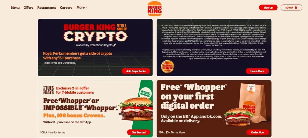
You may have noticed large fast-food chains such as McDonald’s or Burger King use the color red in their logos and web design. This is because red tends to stimulate appetites and is more heavily associated with impulse buying.
Use Yellow and Orange For Optimism
Yellow and orange are both great for instilling feelings of happiness, confidence, friendliness, and caution. Orange tends to give a sense of security whereas yellow attracts attention, making them perfect for your landing pages (used sparsely!) Yellow also tends to give brands a more fun and friendly vibe.
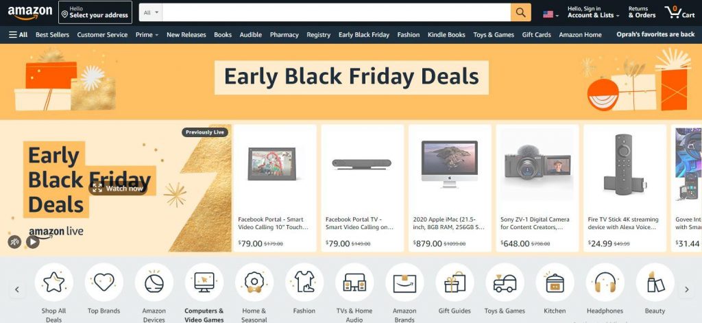
Think of Amazon, which uses yellow as its “Add To Cart” button at the top of its page. Another example is RIPT, they changed the color of their CTA button from monotone black to green and saw a boost in sales. They then created a variation of the button with yellow and saw a 6.3% increase in sales!
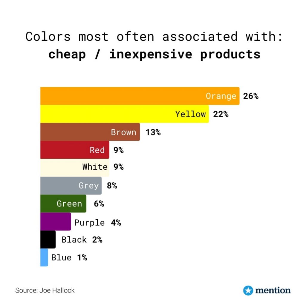
What’s interesting is that around 26% of people associate orange with cheap products whereas 22% relate yellow with affordability.
Use Green for peace and growth
When you think of brands that incorporate green in their primary branding, you probably think of eco-friendly brands. The color green tends to convey the message of growth, harmony, vitality, fertility, exactly why it is so popular with organic and vegetarian brands because it gives the perception of an eco-friendly product.
Green is also great for us on landing page elements as it tends to give one a sense of balance of emotions and clarity, which also helps in decision-making and is used in stores to help consumers relax.
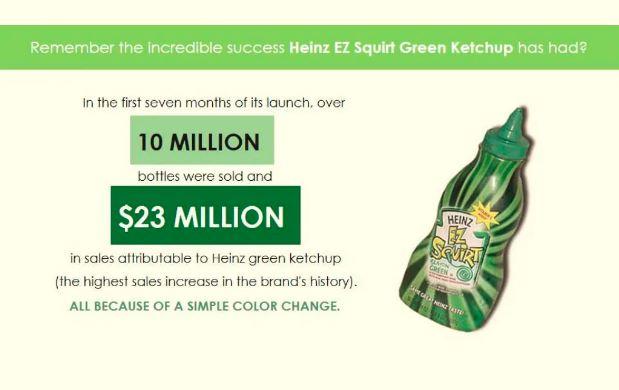
One great example of how the color green can impact your brand sales, consider Heinz EZ Squirt Blastin’ Green ketchup. Heinz changed the color of their ketchup branding from red to green and received a huge surge in sales. By the end of it, Heinz reported $23 million in sales (the highest ever recorded in their brand history!)
Use black for elegance and prestige
The color Black is like a double-edged sword. On one end it symbolizes death and mystery while on the other end it symbolizes luxury. Black tends to give an air of elegance and luxury which explains why most of the top high-end luxury brands incorporate black in their brand logos and web design.
Statistics show that around 28% of the most famous brands use black and grey notably as their branding colors. Think of high-end brands like Chanel, Lamborghini, Prada, and Apple. They are all huge corporations that use black in their web design. The American Express Centurion Card—commonly known as the Black Card—is another super-luxury product that has built its aura of prestige around the color black.

Black tends to give the elements of your landing page a more sleek and elegant look, you can also create a sharp contrast with certain colors and highlight the key elements of your website.
Avoid Colour Overload: Use tons of white space
Now that you know what emotion each color evokes, you’re better equipped to choose the colors for your landing page. But be careful when using colors, you don’t want to use too many colors as it can make your web page look cluttered. Instead, make sure you’re using plenty of white space.
White is a great color in itself, it gives a clean, minimalist appearance when used in designs and is great for adding contrast to your web pages.
Using white space will also improve the readability of your content and make it more “easy on the eyes”.
Choose your colors wisely – Don’t just leave it to the designers.
For one, there is no one standard color that works for CTA buttons or landing page elements. Just because green worked for Heinz or yellow worked for Amazon doesn’t mean the same applies to your brand. If that were the case, all brands worldwide would be using the same colors. What you need to do is explore the right color for your brand and your audience. This is incredibly important – brands have gone so far as to trademark colors to leverage in their marketing.
Start by testing our colors for your landing pages, leverage A/B testing while doing so, and get quantified results to prove which color would work best for your audience with your products. Make sure you find a color that works for your brand and adds for visibility and higher conversions.
Try to actively participate in this process, don’t let your web designers dictate what colors would work best for your webpage. After all, aesthetically pleasing colors aren’t everything. Instead, choose a color that delivers the message you want to deliver. Color psychology will help you narrow down your choices to a highly converting color palette for your landing page!
Why is it important to take psychological color associations into account?
As mentioned earlier, when consumers visit your website, they tend to make up their mind in the first few seconds, this make or break moment can either land you with a conversion (a share, a sign-up, or even a sale!) or.. it can lead to them moving on and you’ll end up losing a potential customer forever.
This is where color associated steps in. You start by creating a great content copy with effective CTAs (content is king after all!), and then use psychological color association to wrap it all together. It’s important to study color associations when incorporating them into your landing page.
If you don’t know what the colors you’ve chosen invoke, you may end up passing on a message you didn’t intend to deliver in the first place.
Consider the example of red and blue in the fast-food industry. Red is great for stimulating appetite but at the opposite end, blue inhibits the stimulation of appetite. This is why using blue as the primary branding color of your fast-food chain may seem a bit odd.
Conclusion
We are naturally inclined to process visuals and colors at a much faster rate than text. The same applies to the visitors on your landing page. Color psychology can have a huge impact on the way your potential customers react to your products. Study color psychology and curate an engaging color combination for your landing page so you can grab your visitors’ attention. To summarize:
- For your content copy use lots of white space sparingly with a pop of contrasting color.
- Use bright colors like red, orange, yellow for your call-to-action buttons.
- Test out the colors on your landing page to see which works better for your demographic.
- Make sure the color you use effectively delivers your brand message.
The internet is filled with brands and all sorts of colors, using the right colors with the right audience can drive sales for your brand, increase your landing page conversions and resultantly, boost your ROI.