Understanding The Value Of Table Graphs & Charts – A Guide With Examples
Table of Contents
Visual representations of data are all around us. Every day, we see companies, news outlets, researchers, analysts, and more, use graphs and charts to convey information and extract conclusions from it. This is especially valuable in a business context, where data has become a company’s biggest competitive advantage.
That being said, as much as visuals can make our analytical experiences easier, they can also become our worst enemy if not used correctly. That is why, at datapine, we are putting together a series of blog posts that do a deep-dive into the different types of graphs and charts to help our audience understand the role each visual plays in their analytical journey and how they can be used to extract the maximum potential out of their data.
We have already covered many types of graphs and charts, including bar charts, column charts, area charts, line charts, and more. Today, it is the turn of table charts. While they might not be considered a traditional chart type as the others we just mentioned, table graphs are arguably the most popular means of displaying and storing large volumes of raw data. Making them powerful tools for organizations of all sizes.
What Is A Table Graph?
A table graph is a type of data visualization that uses rows and columns to organize and display numerical or textual data. While they are less visually appealing than other graphs, they are highly valuable in representing large volumes of raw data and extracting conclusions from it.
The simple and highly efficient nature of tables has made them one of the most popular ways of representing data in numerical or textual form. We see them daily in print and digital media, restaurant menus, computer software, educational scenarios, and the list goes on and on.
From a design perspective, table charts are fairly simple visuals composed of rows and columns. The first row, known as the header row, represents the content of the rows under it, forming columns that connect to tell a complete data story. Data tables can be smaller or very large depending on the use case, and their versatility makes them valuable tools for any industry.
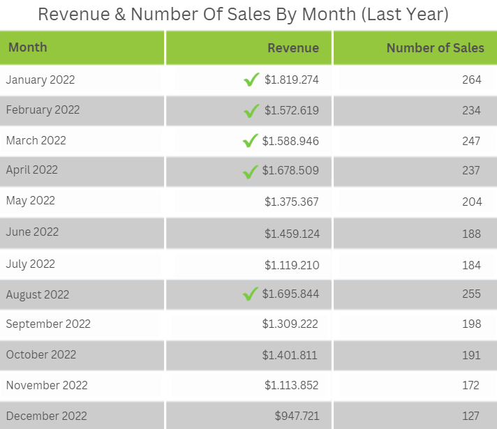
Traditional table chart creators, like Excel, allow users to generate tables with multiple filtering and formatting options like line buttons, links, and menus. Modern online data analysis tools, like datapine, take it a step further by allowing users to mix tables with other types of visuals, add more advanced filters, and even add icons to support data storytelling. For instance, the table chart example above shows some values with a check icon. This could mean that a specific sales target was accomplished that month, making it easier for decision-makers to spot low-performing months and dig deeper into them. Likewise, icons, such as a red exclamation mark, can be added to alert users of an anomaly or any other situation requiring attention.
Tables vs. Charts & Graphs
So far, we’ve considered tables as a chart. We know that, technically, a table is different from a chart. So, let’s discuss some of the main differences.
While tables have an intuitive grid-like interface where the data can be easily filtered and explored, they are still more challenging to grasp than traditional charts like bars, lines, or pie charts. This is simply because they often store large amounts of data. On the contrary, charts like the ones we just mentioned show a smaller version of the data and are also visually engaging. Allowing users to easily understand each data set's proportions and make faster interpretations.
Another aspect that makes graphs and tables different is their focus. Tables are better when the user needs to find the precise value with no errors. On the other hand, graphs and charts can sacrifice the exactness of a value as their focus is an accurate visual representation.
An additional difference, as we have already learned, is tables display data in its raw form, allowing users to perform granular analysis and extract valuable conclusions. Charts and graphs, on the other side, provide a more streamlined perspective that is also extremely valuable for finding relationships, patterns, trends, and much more.
These differences don’t make one better, as their use case will depend on the audience, the data type, and, most importantly, the analytical goals. In the end, both are valuable representations of data, and for this post, we will consider tables as a type of chart.
Try our 14-day free trial & benefit from professional table charts today!
When To Use Table Charts (And When Not To)
When you want to find information quickly: While they might seem a bit overwhelming at first glance, tables are highly intuitive due to their familiar design and how the data is organized and displayed. This makes them the perfect tools to identify exact values quickly and support efficient decision-making. For example, to filter and identify best-selling products and highest-selling months or to quickly look for information about an employee, such as their age, address, or salary, among other things.
When you want to display large volumes of raw data: Expanding on the point above, the biggest benefit or use-case of table charts is to represent raw data. Their structured and organized design allows users to store, filter, and retrieve large volumes of raw information in an engaging and summarized manner, helping them quickly identify values, trends, and relationships.
To compare data: Due to their grid-like format, tables are great tools to compare data based on multiple categories, as side-to-side and up-to-down comparisons can be made at a glance. For example, imagine you need to compare values with multiple units of measurement. This would be very hard to display on other charts, making a table the best option.
Now, you might be wondering when I should not use a table graphic. As mentioned, these tools are best for displaying large volumes of raw data and to make comparisons. They are not the best choice when you want to find trends, patterns, and relationships, as their format makes it harder to identify outliers at a glance. In those cases, it is best to use another type of graph that is more visually driven.
Types Of Data Tables
At a simple level, data tables can seem like boring grid-like tools containing massive amounts of data. The truth is tables are complex interfaces hiding valuable insights that can lead a business to improve its strategies in ways they never thought possible. This is in part because they are versatile. Their format and shape can change to meet the user’s needs, making them invaluable analytical assets. Below, we will explore the most common types.
Traditional table
This refers to the traditional format we get from any professional table generator. They offer a mix of numerical and textual data that can be filtered, highlighted, formatted, and manipulated at will. It can be anything from an inventory table showing product names and IDs, prices, and stock levels to a customer list showing name, age, occupation, and more. They are the most versatile types of tables and can be used in any context.
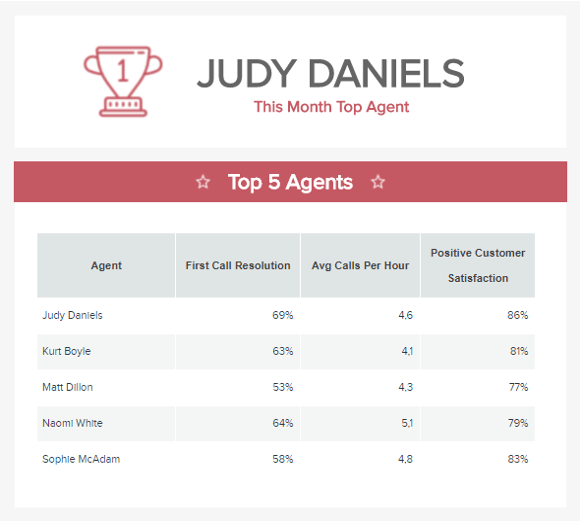
Our example above, generated with a professional table graph maker, shows the top 5 customer service agents based on the first call resolution, average calls per hour, and positive customer feedback. With this information in hand, decision-makers can compare the performance of the different agents and find improvement opportunities to boost their customer service strategies.
Textual table
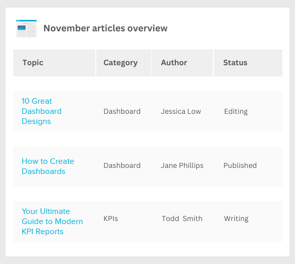
As its name suggests, these are tables that display only textual data. For example, a breakdown of articles with the URL, topic, author, and website section in which it is published. Or a directory of employees with their names, addresses, emails, and job titles.
In most cases, non-numerical tables can become more challenging to analyze as comparisons are harder when dealing with text. Therefore, to make the most out of them, you should avoid wordy cells or language that is too complex to understand. You should also ensure you align all text data to the left to allow for intuitive scanning of the words.
Table combined with other charts
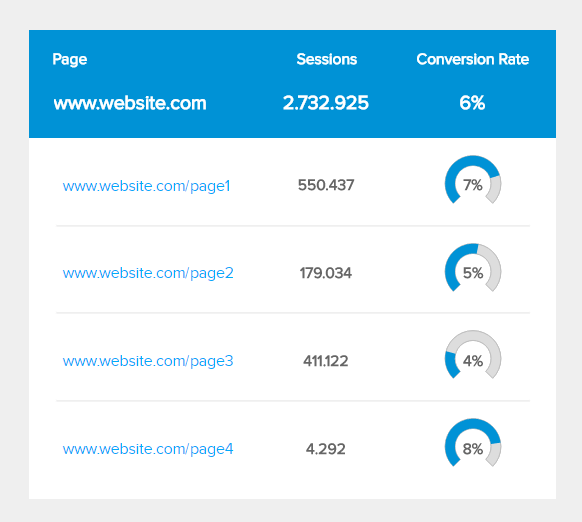
Thanks to the power of modern visual analytics tools, users can generate tables and combine them with other charts to get a complete picture and achieve a detailed analysis process. The image above shows the landing page conversion rates tracked in a table with individual horizontal lines. Each row in the conversion rate column is complemented with a gauge chart showing how far or close each landing page is to the website's overall conversion rate. This is a great way to make tables more engaging and visually appealing.
It is important to note that the types of table graphics might vary depending on the tool you decide to use. The three we described on top can be considered the standard ones.
Try our 14-day free trial & benefit from professional table charts today!
How To Make A Table Chart: Tips & Best Practices
Depending on their purpose, table graphics vary in shape, size, and complexity. However, no matter their use case, there are standard best practices you should follow to ensure you successfully create a table. Like other visualizations discussed in this series, your tables should be simple, focused, and highly interactive. Below, we will tell you how to achieve this.
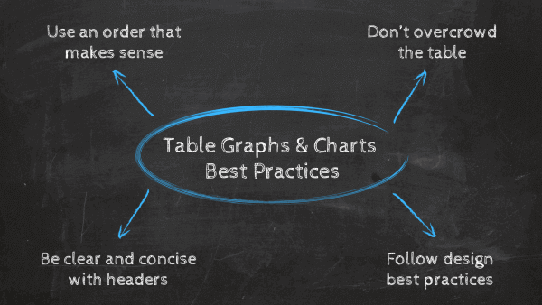
Use an order that makes sense
Tables are highly intuitive visuals that make analyzing data a more agile and efficient process. That is, if columns and rows are arranged correctly. Therefore, we recommend you organize data in an order that makes sense to the purpose of the analysis. For example, if you track yearly sales, organize the values chronologically to help users compare the years and extract different conclusions. Likewise, if you are tracking sales by product, your data should be arranged for swift analysis. For example, adding the product name first, its identification code, the number of products sold, and so on.
Don’t overcrowd the table
If you have read other posts from our graphs and charts series, you must be aware of the importance of prioritizing simplicity when dealing with any kind of visual representation of data. The story is the same when it comes to tables. When generating a data table, you should first and foremost think about the goals and audience. Doing so will help you focus on what is important and arrange everything in a way that is efficient and makes sense. While table graphs can fit large volumes of data, you can end up fitting so much that it distracts your analysis. Therefore, always keep a focus on your goals.
On that same note, you should also avoid using any 3D effects, shadows, and other elements that will make the table harder to look at. More on this on the next point.
Follow table design best practices
There are many best practices you can follow when it comes to designing a successful table. These refer to the position of the values, formatting, labels, and others. Below, we discuss some of the most important ones you should consider.
- Choosing the best row style is paramount as it can make the data more easily digestible. If you are dealing with dense tables, you can choose to do a grid style with horizontal and vertical lines separating the values, or you can also do single horizontal lines to make it easier for the eye. Alternatively, you can use “zebra stripes,” alternating background colors to separate rows.
- As a rule of thumb, you should always ensure there is contrast between the header text and the rest of the values. You can do it by adding a different color background to the header or setting the text to bold.
- Keep all text data aligned to the left and all numerical data aligned in the middle. Likewise, headers should be aligned according to their column data.
- Another design best practice is to keep it simple. Use fonts that are clear and not too distracting. While getting creative with colors, fonts, and formatting seems fun, every choice should make sense and provide value when analyzing the table.
- Expanding on the point above, you can use colors and lines to highlight important information. For instance, add green and red backgrounds to show positive and negative values. You can also use thicker line borders to group related values to showcase a trend, for example.
Be clear and concise with headers
When working with a table graph, having appropriate headers is paramount to ensure the data can be sorted and analyzed correctly. When choosing headers, you should also consider the level of knowledge of your audience. For example, if you build a table displaying website page performance and need to add a header for CTR, CPC, and other standard marketing metrics, you must ensure your audience understands what those mean. If that is not the case, then use the complete name or add a small legend somewhere with the meaning.
Paired with that, you should also refrain from adding the abbreviation of the unit of measurement on every single cell, as this will become visually unappealing. For example, adding “mm” after every value when measuring millimeters. Instead, put the unit of measurement in a parenthesis right next to the column or row heading. That way, table users will immediately know that all values on that column or row are millimeters.
Table Chart Examples & Templates
So far, we’ve covered a definition of table graphs, went through the main types, and provided some valuable best practices to help you generate them successfully. To finalize this insightful guide, we will show you some examples of how these tools can be of value in different industries and business functions. These examples represent valuable KPIs generated with professional KPI tools.
- Procurement
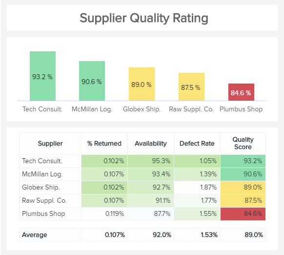
The first data table example is for procurement analytics, which tracks the supplier quality rating. Here, we can see the table tracking the supplier's name and some quality indicators adding to a final score. The table uses conditional formatting to highlight the highest scores with shades of green to help users understand at a glance which areas each supplier is under or over-performing. Conditional formatting is also applied to the last column, where we can conclude that Plumbus Shop's supplier has the lowest quality score marked in bright red. The color coding can also be taken to the chart on the top, where the supplier quality score is displayed.
- Marketing
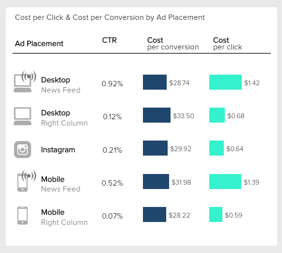
Next, we have a table graph template for the marketing department, which tracks the CTR, CTC, and cost per conversion of ads for different channels. What makes this table so valuable is its visually appealing design with icons that represent the different channels and horizontal colored bars to represent the costs. When it comes to analyzing ad performance, it is of utmost importance to be able to extract conclusions fast, as every day that passes the ad costs more money. Therefore, having an overview like this is very helpful for making the agile decisions needed to succeed.
- Sales
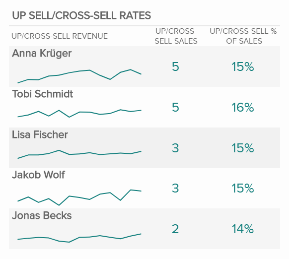
This next table chart template perfectly adds to a professional sales dashboard. It tracks the upsell and cross-sell rates of five sales agents. The template, generated with a professional data table maker, combines the traditional format of a table with “zebra stripes” with a line chart to dig deeper into the data and spot valuable trends. Having this valuable sales KPI depicted in a table enables managers to identify the best-performing agents and provide additional training opportunities to the underperforming ones.
- Finance
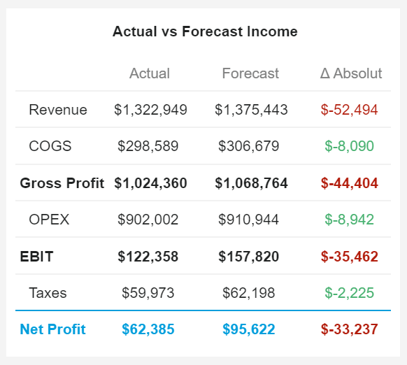
Our list of table graph examples would not be complete without mentioning the financial department. Arguably, one of the areas that can benefit the most from tables as they need to work with exact values to make accurate decisions. The image above tracks the actual vs. forecasted income to understand if the initial financial expectations of a company are being met or if something needs to be improved. The third column shows the absolute difference between the actual and the forecasted amount. Each value on the column is colored red or green to indicate if the difference is positive or negative. Overall, we can see that the net profit is way lower than it was supposed to be. Depending on the business goals and expectations, this can be a negative sign or nothing to worry about. To get a bigger picture, decision-makers can invest in a professional dashboard application to get a 360-view of their financial performance.
- IT
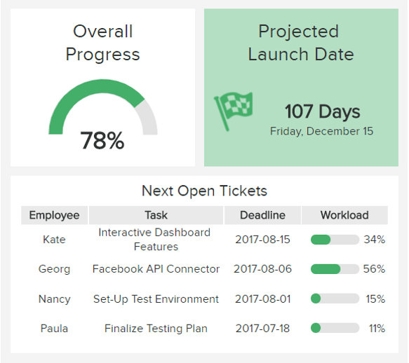
Lastly, we have an example of a table chart for the IT department, tracking the total vs. open tickets for a project. On top of the example, we can see a gauge chart tracking the overall progress of the project as well as a reminder of the launch date. Below this information, we get a small data table chart tracking the next open tickets with a breakdown of the employee in charge, the task, the deadline, and the employee's workload level. For example, we can see that Georg has a 56% workload, which could mean he might not have time to finish his task on the expected deadline. If this is the case, you can compare it to other employees like Paula, who only occupies 11% of the workload. Therefore, she could take over another task to prevent the project from being delayed.
Try our 14-day free trial & benefit from professional table charts today!
Table Graphs: Final Thoughts
If you are reading this, congratulations! You have made it to the end of our journey to understanding the value and usefulness of table charts. As you learned throughout this post, table graphs are powerful tools to display large volumes of data and dig into it at a granular level. They are also incredibly useful when analyzing exact values with no margin of error. That is why an infinite number of companies across industries and functions rely on them to support their analytical efforts. They allow for swift and accurate comparisons that enable the extraction of valuable conclusions to inform strategic decisions.
That said, table charts are not the best option for extracting trends or finding relationships in your data. For that purpose, many other visuals can help you bring your data to life most compellingly. Even better, combining different data visualizations, including tables, in an intuitive business dashboard can build a complete picture of your performance and make informed decisions that will skyrocket your success.
So, if you are ready to start generating professional tables, then try our professional online data visualization tool for a 14-day free trial today!