Visual hierarchy plays a big role in the design and user experience of your website.
The success of a website depends on its ability to guide users effortlessly from point A to point B. That’s where visual hierarchy comes in. It’s about using size, color, and layout to direct attention and make browsing intuitive.
When you look at a website, your brain quickly figures out what’s important. That’s a visual hierarchy at work. It’s not just about design; it’s about making sites easy to use.
So, whether you’re a designer hustling every day or you run a design agency, this is for you.
Here we’ll talk about the nitty-gritty of visual hierarchy and why it’s the backbone of effective web design.
Let’s make sure your designs don’t just ‘pop’—but they perform too.
Table of Contents
What is Visual Hierarchy in Web Design
Visual hierarchy in web design is all about arranging elements on a webpage in a way that shows which are the most important.
It’s like a guide that helps visitors see the most crucial parts first and understand where to look next.
Think of it as a map that highlights the main attractions, making sure you don’t miss anything important while browsing a website.
This includes arranging the content, visual media, color schemes, contrast, typography, white space, and layout, among other things.
Usually, designers add everything in the order of importance. Naturally, the most important element is to get the prime spot.
Why does visual hierarchy matter so much in web design, you ask?
Attention span!
Your website needs to catch people’s attention fast. Nowadays, visitors lose interest quicker than a goldfish, in just over 8 seconds. And it seems like we’re getting more distracted every year.
That means you’ll need a strong visual hierarchy in web design.
How Humans Process Visual Elements
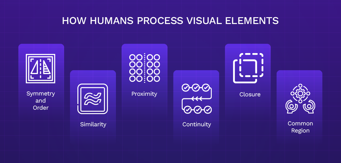
The human brain does some amazing stuff to understand visual elements. Gestalt Principles are a set of rules developed by psychologists like Max Wertheimer, Wolfgang Köhler, and Kurt Koffka.
These principles explain how the human mind translates everything it sees as a whole.
In simple words, Gestalt Psychology states that we tend to see one whole image instead of its many parts. For example, when you see a book, you don’t see the cover, back cover, and the pages separately. Instead, you just see one book.
Gestalt psychology uses many principles, including:
- Prägnanz (Symmetry and Order): We see things in their simplest form or order
- Similarity: We group similar things together
- Proximity: We view objects near each other as a group
- Continuity: We see items arranged in a line or curve as related to each other
- Closure: We perceive elements from a closed object as a group
- Common Region: We tend to group objects from the same bonded area
So, where do these principles apply in web design?
In the early 1920s, designers and marketers started using these principles. With the rise of digital technology, they become integral to web designing. Today, web designers and marketers believe all humans share a pattern or characteristics when seeing visuals.
You will see two types of visual hierarchy in web design – the F Pattern and the Z Pattern.
Let’s take a quick look at them.
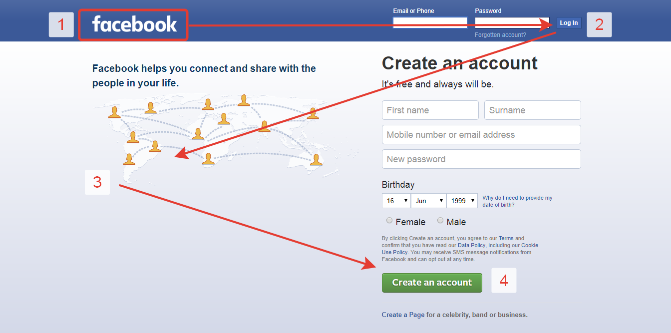
F Pattern
This is the most common pattern, especially for text-heavy content. The Neilson Norman group discovered this pattern using eye-tracking technology in 2006. It has been a critical element of visual hierarchy in web design ever since.
This pattern follows the shape of F as users scan a web page. Initially, users start at the top of the page and read across it horizontally.
Then, they move down the page slightly in search of short subheads and scan them, which forms the second, shorter bar of the F.
As the users scan the left side of the content vertically, it forms the stem of the F. The vertical movement involves quick scanning, not thorough reading.
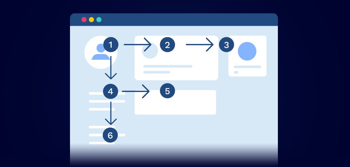
Z Pattern
Z pattern is another way to include visual hierarchy in web design. In the Z-Pattern, too, the eye movement starts from the top left and moves horizontally to the right. But then it goes diagonally down to the left and again horizontally to the right.
This pattern is perfect for minimal web designs like landing pages or portfolios.
Although different, both patterns play a critical role in ensuring visual hierarchy in web design. That, in turn, helps you enhance the overall use experience.
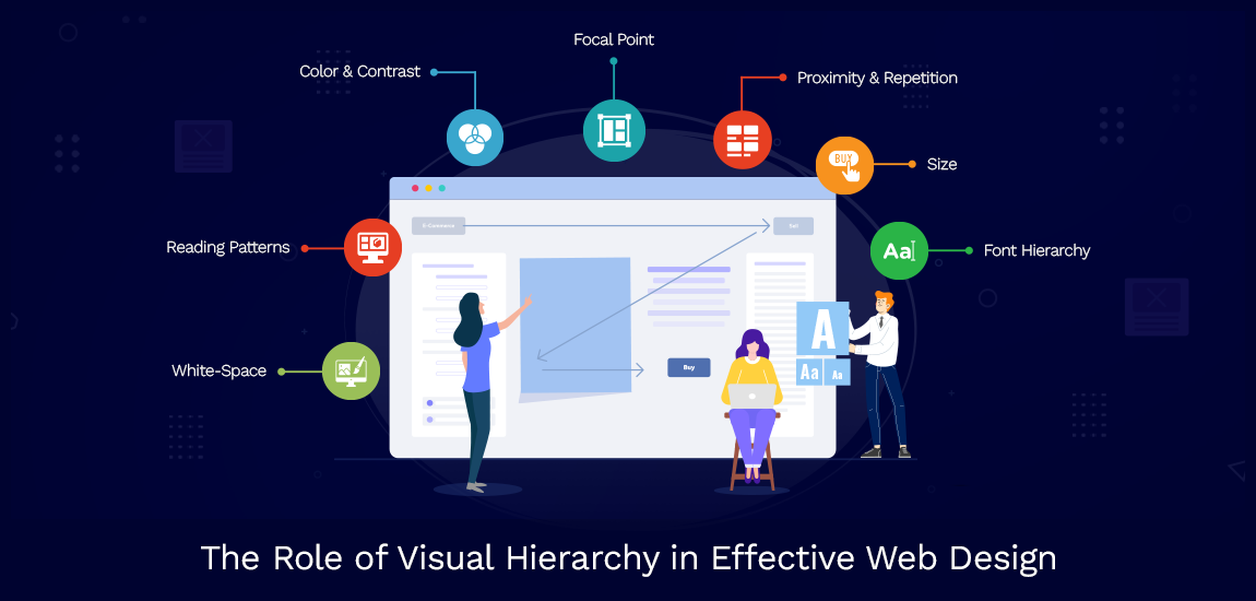
7 Visual Hierarchy Principles You Should Know
Whether you choose the F or Z Pattern, you will need to keep a few visual hierarchy principles in mind. Remember that these principles are based on Gestalt Psychology.
So, when including visual hierarchy in web design, keep the following in mind:
1. Size
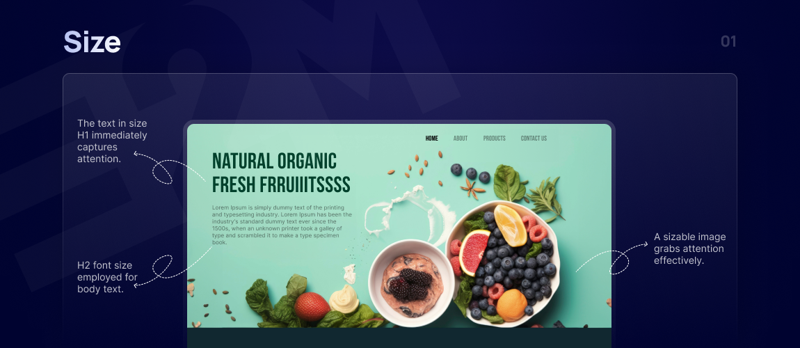
Size is the most fundamental principle in the visual hierarchy. Large-sized elements naturally draw more attention.
In other words, you can use the size to increase or reduce the visibility of a visual. Of course, the most critical parts of a design will be large.
For instance, the title of a blog post or a headline is usually bigger than the rest of the content. It’s that simple. Make the key parts big, and your message will stand out.
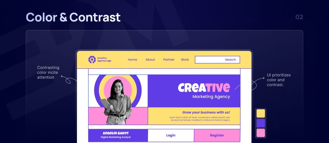
2. Color
Color is an equally crucial element. You can differentiate colors based on their brightness, hues, and saturation. You can use bright colors to highlight the most critical information or images.
However, different colors evoke different emotions. For example, the blue color evokes relaxing and calming emotions. It’s the most popular color for websites, with 46%, followed by green (30%).
Although colors evoke emotions, never drench your website in too many colors. It’s okay to go with a combination of only two or three colors.
3. Contrast
Contrast is the difference between two objects. It’s a critical part of ensuring visual hierarchy in web design. Contrast, when used correctly, can make your web design visually appealing and draw users’ attention. You can use bright colors against a dull background to help a particular element stand out.
Web designers tend to use warm and cool elements to create visual appeal. They use contrast to make the website more attractive.
4. Alignment
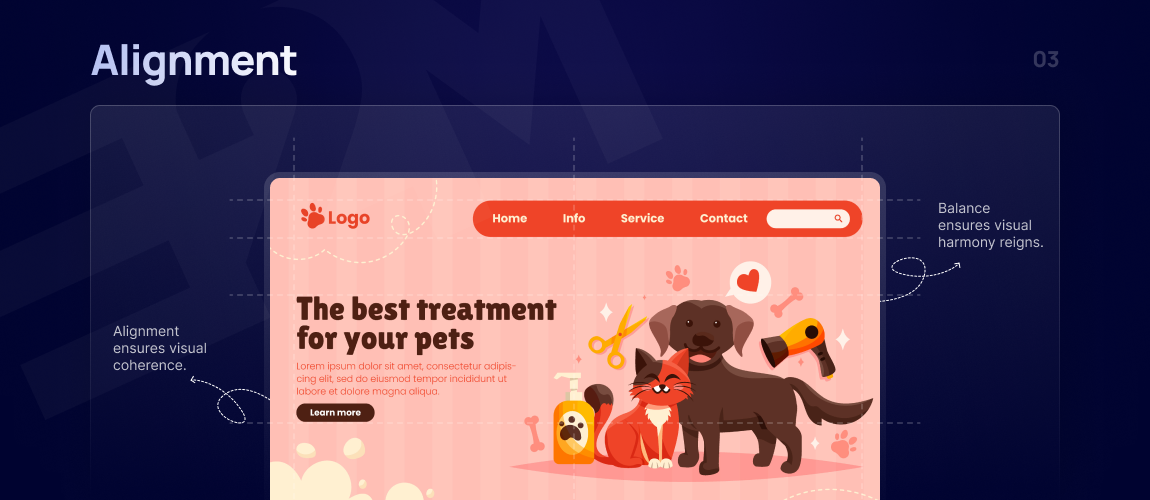
You need balance to ensure visual hierarchy in web design. When elements are aligned, it creates a cleaner, more organized look. It reduces visual chaos and helps users navigate the content more easily.
However, alignment is not just about positioning elements neatly. You also need to create a visual relationship between different elements. That’s what helps you maintain a visual hierarchy in web design. It keeps your users focused on the areas that matter.
5. Repetition
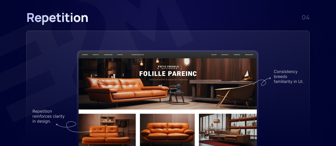
Repetition is another way to create a visual hierarchy in web design. It involves using certain elements and styles repeatedly throughout your design. Repetition leads to consistency, which, in turn, keeps the users glued to the screen.
Moreover, repetition can reinforce branding. Using your logo, brand colors, and typography can help strengthen your brand identity. Thus, repetition can help users recognize and recall your brand, creating a more cohesive user experience.
6. Whitespace
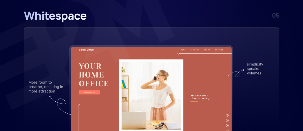
Whitespace, also known as negative space, is the empty space around and between elements in a design. It’s a fundamental component of visual hierarchy in web design. Whitespace helps you enhance the balance and readability of your overall layout.
It’s a common misconception that whitespace matters only in minimalist design. However, it can significantly increase user focus in all web designs, minimalist or not. Whitespace provides a visual breathing space for users, which makes your content more engaging and less overwhelming. That’s why whitespace is more important in an age where users skim through the content.
7. Texture and Style
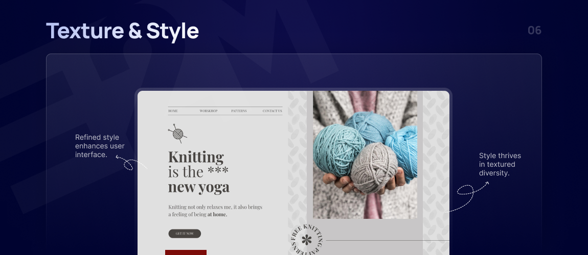
Using the right textures and styles is vital for maintaining visual hierarchy in web design. For instance, textures, whether subtle or bold, can make your web elements more appealing and engaging. You can also use them to differentiate sections.
The most common texture and style choices are gradients, shadows, or patterns. For example, a CTA button with a slight gradient and shadow is more desirable. It can quickly attract users’ attention. It could encourage them to buy your product or subscribe to a newsletter.
However, overusing texture and style can lead to a cluttered design. Always maintain a balance and use textures and styles thoughtfully.
8 Tips to Improve Visual Hierarchy
Whether it’s alignment or contrast, you have to use each design principle carefully. Here are eight ways to boost visual hierarchy in web design.
1. Define Your Website’s Goals
Start with a clear goal for your website. Is it to boost sales, generate leads, or inform visitors? Your design should align with these objectives.
For an eCommerce site, create a visual flow that leads shoppers to buy, highlighting CTAs, purchase buttons, and product visuals.
For an informational site, like a law firm’s page, prioritize easy access to resources and scheduling options. Ensure each element serves your site’s purpose and enhances the user journey.
2. Target Audience
Your design should speak directly to your audience’s preferences and habits. Know their devices—younger users often prefer mobile, so a mobile-first approach is key.
For older users, focus on a robust desktop experience. Tailor your design’s look and feel to match demographic tastes—vibrant and lively for Gen X, or sleek and professional for B2B.
The bottom line is – to keep your customer personas in mind. It will help you create a more engaging and effective website.
3. Understand Content Priority
Another factor to consider is content priority. Every element can’t be the star; you need to decide what gets top billing. It’s like a spotlight on your main act. Use headings to structure your content—make it clear what’s the lead.
It helps you create a progressive visual hierarchy in web design. It’s about giving users just enough to keep them engaged without dumping everything on them at once.
Break down your content into bite-sized pieces that lead users through your site with purpose.
When users find what they need without the fuss, they’re more likely to stick around. That’s the long-term win of getting content priority right.
4. Use Size and Scale
Size and scale are powerful tools in creating a visual hierarchy. The biggest element on your website will naturally attract more attention.
So, if you want an element to stand out, use size and scale to enhance its visual importance. It can be anything – an image, text, or even a CTA.
Smaller elements, on the other hand, can be used for less critical information. But like any other element, you need to balance the scale and size.
Not every important element or piece of content can occupy the entire space on your webpage. You could end up overwhelming the target audience if your focal point is too large.
5. Choose Typography Wisely
Typography is one of the most critical parts of your visual hierarchy. The best examples of how to use typography are in newspapers and magazines.
Usually, you will see one big headline, a mid-sized subheading, and a smaller text. You can follow the same design pattern for your web design.
Typically,
- The headline will be the most important element. Use bold, bright, and large typography for your headline.
- The subheading can be smaller than the headline. It should convey the message or help your users find what they want.
- The third element is the smaller content that describes your services or compromises your marketing message. However, this description should be short, to the point, and insightful. For instance, if you are talking about your services, tell the users how your services can benefit them.
6. Incorporate White Space
As mentioned before, you have to use the white space more effectively. Whether or not your website is content-heavy, focus on using the whitespace to its full advantage.
Whitespace draws users’ attention quickly and makes your content more readable. It lends your website a more sophisticated look.
It also prevents your website from looking cluttered. A clean, easy-to-read look offers a better user experience to your potential customers. Thus, strategic use of white space can help you generate more sales.
7. Develop a Wireframe
Think of wireframes as the foundation of visual hierarchy in web design. It helps you plan the layout, decide which element goes where, and finish the design without getting distracted by the design details.
This black-and-white, two-dimensional visual guide will also help ensure everyone, including the website owner, is on the same page.
A wireframe will also help you:
- Organize the content
- Understand whitespace and element distribution
- Keep usability to the front and center
- Plan the overall flow of the website
- Arrange all the elements in the desired order
8. Maintain Consistency
While you want to be creative when designing a website, you cannot ignore consistency. To maintain visual hierarchy in web design, you must ensure consistency in elements like color schemes, fonts, and button styles. It lends your website a professional and sophisticated look.
But above all, consistency boosts user experience. It helps the target users familiarize themselves with the navigation and layout patterns.
Conversely, inconsistency can confuse users and distract them from your website. So, whether it’s the logo or color scheme, be sure it remains consistent throughout the website.
Conclusion
Visual hierarchy is all about making your website easy to use and nice to look at. It’s the secret to turning visitors into regulars. Keep it simple, make it clear, and watch your site do the work for you.
You want a website that converts clients for you, right? That’s where we come in. At E2M, we’re all about helping digital agencies with our white-label web design services.
Need a hand with your web design? We’ve got you covered. Check out our services or drop us a line to see how we can help you!


With 15 years in the industry, his expertise spans HTML5, CSS3, jQuery, PHP, and open-source platforms like Magento, Opencart, and WordPress. He leads a dedicated team of designers, developers, and artists to deliver innovative solutions for a range of projects. Ajay's focus is on helping agencies establish a strong online presence through quality design, branding, and development.
When he is not coding, he enjoys traveling, reading, and watching movies.