


Remember how we used to talk about responsive website design, and the need to consider mobile device users?
Well, the internet is well past the point in time when more than half of us are using smartphones for access. According to Google, that’s been the case since 2016.
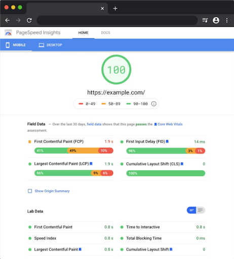
By 2020, about two-thirds of all website traffic was mobile, and in March of 2021, Google made the switch to mobile-first indexing of all websites as it integrated Core Web Vitals into its algorithm.
At the same time, 5G and broadband improvements mean faster data transfer speeds and shorter page loading times, enabling bigger and richer websites that don’t test users’ patience.
The convergence of mobile-first access and high performance expectations from users demands fresh consideration when it comes to B2B company websites, and these proven mobile-friendly website design tips can help ensure you’re not losing traffic — or sales leads — to a poor mobile experience.
While B2B sites often receive more desktop traffic than many consumer sites, the improved page performance of mobile-first design strategies has an impact on SEO performance — and the SERP position improvements alone could be reason enough to implement a mobile-first approach.
The SEO improvements can be twofold: first, since mobile-first indexing is now the standard, the technical effect on SEO is obvious. Second, if your site traffic includes mobile users and you deliver to their expectations, their traffic can further improve your overall SEO performance.
Another important consideration is today’s competitive labor market. Anything manufacturers can do to increase the number and improve the quality of applicants can help create a competitive advantage. Making it easier for prospective candidates to interact with your website on their mobile phones is good business.
RELATED: How Inbound Recruitment Marketing Can Help Grow Your Business
Here are a few things you can do to make improvements that have an impact on user experience and Core Web Vitals performance:
Do you really need to load a Facebook tracking pixel when you’re not running Facebook ads, and your target audience doesn't come from Facebook?
In-depth texts, PDF downloads, and other long-form content pieces play important roles in an inbound growth strategy, but it’s also important to make content that’s easy for your mobile users to engage with. As you work through your editorial calendar, be sure to work in a healthy amount of simplified inbound content that addresses the needs of mobile users, including:
RELATED: 20 Different Types of Advanced Content That Get Results [Infographic] and
Never Run Out of Great Blog Ideas! 40+ Blog Topic Tips for Your Business
More than ever, your business relies on your website to deliver to expectations across the board: marketing, sales, customer service, human resources, and more. It’s not enough for your pages to look good; they need to get results.
Before you get started, understand how to evaluate and improve your B2B website with our free checklist, 10 Key Elements of an Inbound Website. Click the link below to download your copy today.

Topics: Website Design
